UX, Web, Visual Design
From start to finish, I was personally responsible for the design and development of the website. I started by defining what the goals of the website were:
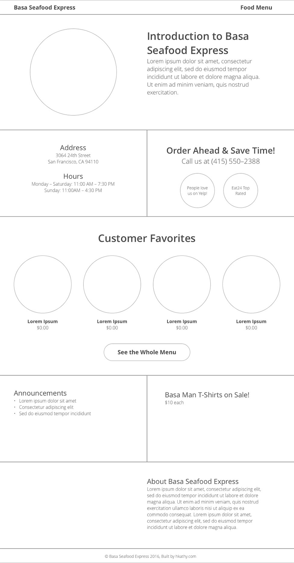
With these in mind, I discussed with the owner what sort of information was necessary to include. I sketched out UI designs in order to figure out how best to organize this information, then created several wireframes.
The wireframes ensured a consistent yet individually optimized look across various screen sizes. Visualizing the UI in this more concrete way helped further determine the proper placement of sections and division of information.
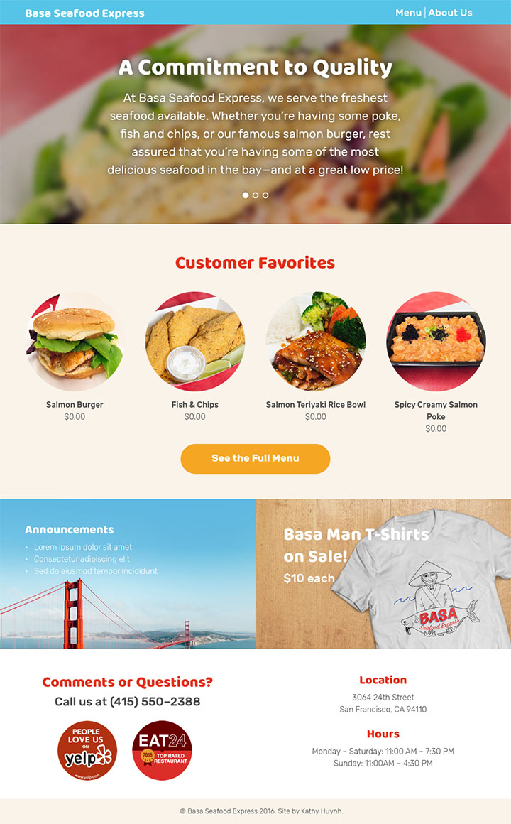
For example, while the location and contact information were initially located right underneath the home page carousel (because I felt that this was one of the most critical pieces of information, so I placed it near the top first), in the end they became footers across all the pages. This solution also falls in line with design convention.
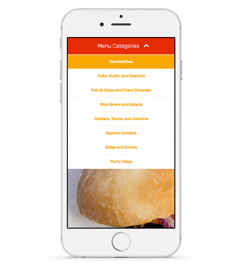
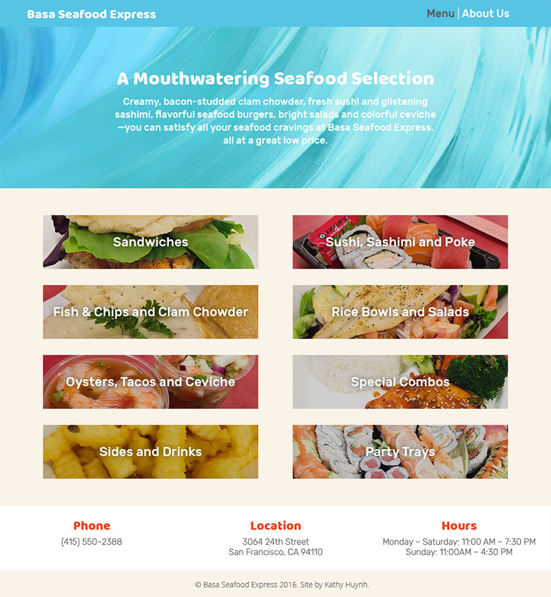
The restaurant menu also had a different design at first. The categories all had their own pages—this was a solution I already knew how to implement, and dividing the menu meant that the user would not have to scroll through a long list. However, this meant that the user would have to click through many different pages to explore the whole menu. However, I challenged myself to pursue the more complex yet efficient solution. The final design used one display and toggled through the different sections through a conveniently located navigation bar at the top.
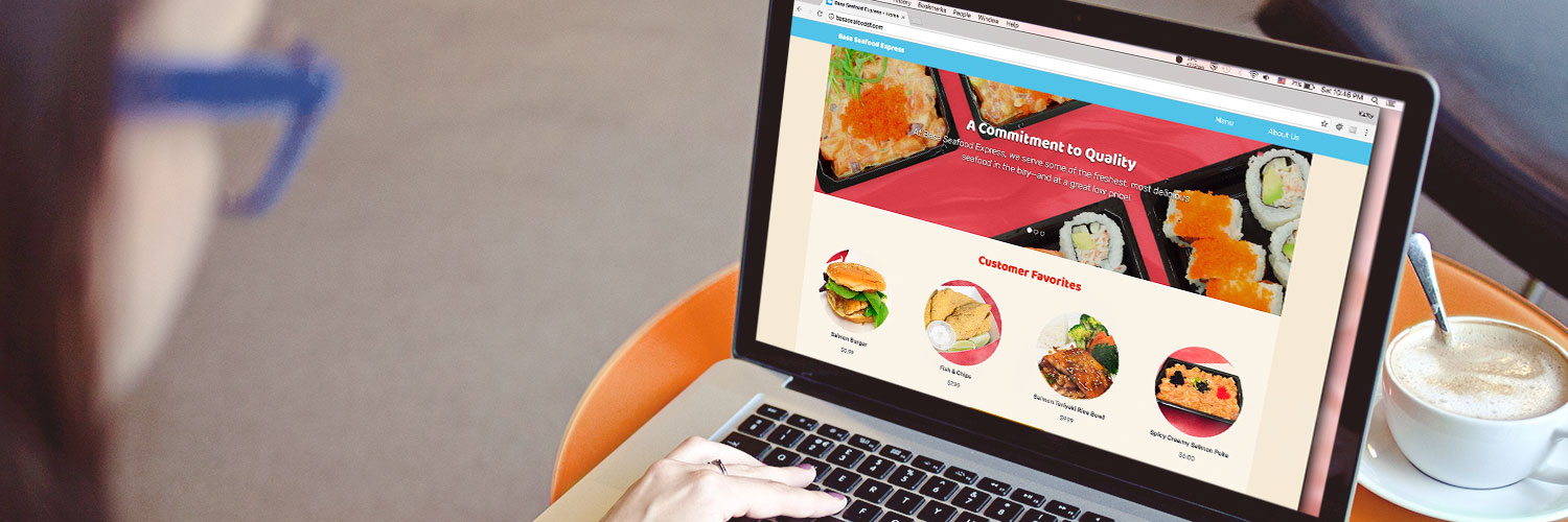
Once the wireframes were finalized, I created a visual identity for Basa Seafood Express. I thought about the atmosphere of the shop and what aesthetic would best suit them. The shop aims to provide quality seafood at affordable prices and with a quick turnaround. Thus, I tried to evoke an image that was friendly and casual, but also neat and simple. This is reflected in the colors, layout, and typefaces I chose. And while the majority of the site is warm in tone (which imparts a friendly feeling and stimulates the appetite), there are splashes of turquoise throughout, as a reminder of the ocean—after all, it’s a seafood shop.
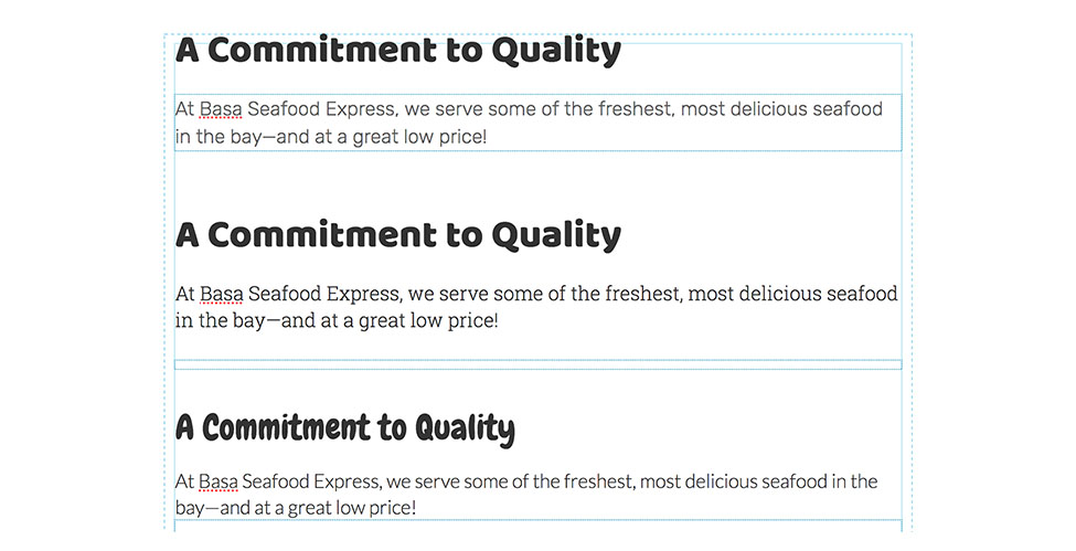
These are just a few of the type combinations I tested.
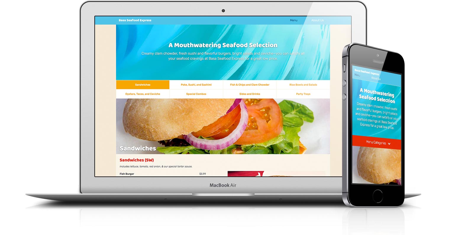
The website neatly adjusts for optimal display across any screen size. Because many customers would like the convenience of viewing the menu from their phones, it was important that the large menu remained well-organized and easy to navigate on the smallest screen sizes.
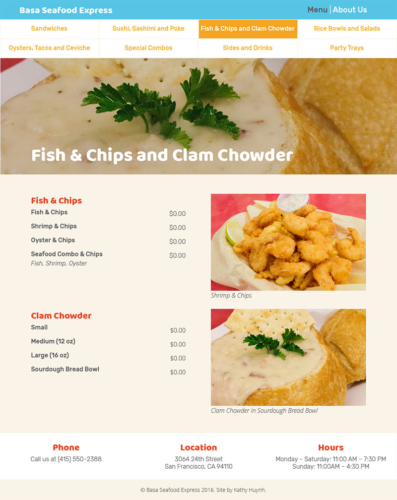
On a large screen, all the restaurant menu tabs are laid out in a neat navigation bar, so that people can instantly jump from section to section. However, on a small screen, displaying all the tabs would take up too much screen space. Thus, I opted for a dropdown menu that collapses after selection, so that customers can quickly and easily browse the offerings.
When users hover over a menu item, the correlating price is bolded. I included this feature in consideration of users who might have difficulty following long rows, making it easy for them to tell at a glance.
The feature I’m proudest of is the dropdown menu that appears on mobile. In order to implement this feature, I learned how to: