UX, Wearable, Visual Design
Once the Signacare system is prescribed to a patient, the patient first receives a microchip implant. The microchip takes a few weeks to read and collect data on the electrical signals running through the user's nervous system. Then, the microchip is individually programmed to correct the signals through chemical-stimulating electrical interference, based on the user's personal needs. The microchip administers signals on a situational basis, rather than emitting a steady stream of interference throughout the day.
At this point, the user is then given a Personal SSNS (Supplementary Sympathetic Nervous System) Watch. The watch notifies the user when their stress levels rise (and subsequently, when the microchip is about to calibrate their stress signals), and also displays a record of the user's stress levels over time. The watch is purely an informational device; only the microchip can alter signals.
Together, the watch and microchip help the user rehabilitate their stress responses, so that the user eventually learns to predict when and how to manage their stress.

Our group developed the project as part of a course on Ambient Interface (Image and Interactivity). Although the physical design of the product was important, we were asked to focus more on how people would interact with our technology and how it would impact their lives.
During our first week together, we decided we wanted to create a health solution for people who had difficulty controlling their stress responses. This group included but was not limited to those with PTSD. We spent the majority of time throughout the course discussing what kind of difficulties our target market faced, how to address those issues, and how to incorporate that solution in our product.
At the same time, we came up with new interface designs almost every week, through iterative prototyping. First we gathered a list of useful features, refined the list as we prototyped, then considered how they would all work in unison, refining the list as we prototyped. Whenever someone proposed a different design, we walked through its improvements (or retrogressions) compared to the last prototype, how to use each feature, and how it would affect the user. Because we were designing for such a small view, we also had to make sure that the interface could be easily read and understood at that size, without sacrificing necessary information.
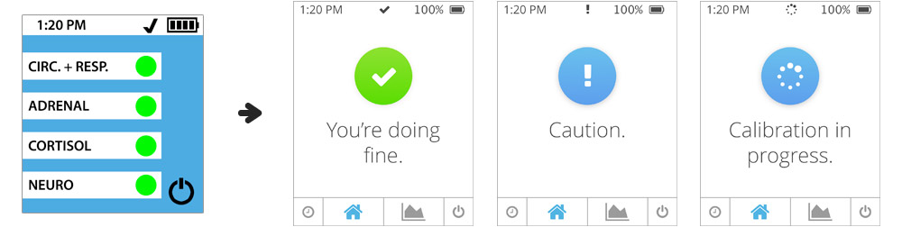
The home view went through multiple incarnations before we arrived at our final design.
The initial and final designs of the stress tracker displayed when a user taps one of the items on the home view.
We had several personas who we would run through hypothetical scenarios with the prototype to determine whether we had covered all their needs. Thinking through these use cases helped us identify and correct faults in our design, as well as understand the limitations of the system. None of our team members were human bio experts, so one of the biggest challenges was implementing a biologically sound solution. However, using the available information, we tried to create the best solution we could by logical reason and focusing on the interaction and consequences.
Barney, a veteran, agreed with his doctor to use the SSNS device in order to battle his PTSD and return to a normal life with his family. One day, after getting ice cream with his daughter, he rounds the end of the car and his daughter jumps out to surprise him. The surprise causes his body to freeze and he begins to experience flashbacks. The SSNS device immediately adjusts the electrical signals from his brain to lower his stress levels. Barney's flashbacks immediately fade and he calms down. He continues to enjoy the ice cream with his daughter.
Don has been using the SSNS device for about a year to help with his anxiety attacks. After a night of shopping at Home Depot, he is walking to his car when a stranger attacks him. Don is immediately filled with fear and adrenaline. The SSNS system understands that Don is facing a serious threat and may suffer an anxiety attack, which could prevent him from taking action. It reduces the intensity of his response without eliminating his need to flee. Don is able to safely escape from the stranger.
Ideally, the SSNS system would be able to differentiate between potential threats and accidental triggers by thorough analyzation of the bodily signals sent in each situation.
Lisa, a student diagnosed with anxiety, has been using the watch for four years to monitor her stress levels. When the notification light on the watch begins to blink, Lisa practices breathing exercises and meditation to lower her stress levels. Lisa has learned to anticipate when an anxiety attack is approaching. Eventually, her doctor tells her that her estimated duration with the device has been reduced by one year, thanks to her personal efforts. Soon, her anxiety may not be an issue and she will not have to rely on the device.
We were especially mindful when designing the interface that we did not include any elements that might further increase the user's stress levels. For example, when the notification light blinks, it is a slowly flashing blue light. If the light blinked quickly, or if it was a color usually associated with danger (like red), it may alarm the user and make them feel as if something is drastically wrong. Instead, we wanted the notification light to appear calm and non-threatening. With this reasoning, we designed the majority of the interface in cool colors.
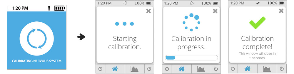
This video demonstrates how the watch guides the user through the bodily calibration process that occurs in response to inappropriately raised stress levels. The purpose of the calibration notification is to help the user feel more comfortable with the Signacare system. That is, it adds some transparency as to when the microchip is active.
Fun fact: I provided the voiceover in the video.
There was also the risk of the user accidentally pressing the wrong button, which is especially concerning at smaller sizes, and also for devices which come in frequent contact with skin. We implemented multiple safeguards to prevent the user from accidentally turning off their watch or microchip. The process for turning off the microchip is detailed in the user guide I created.
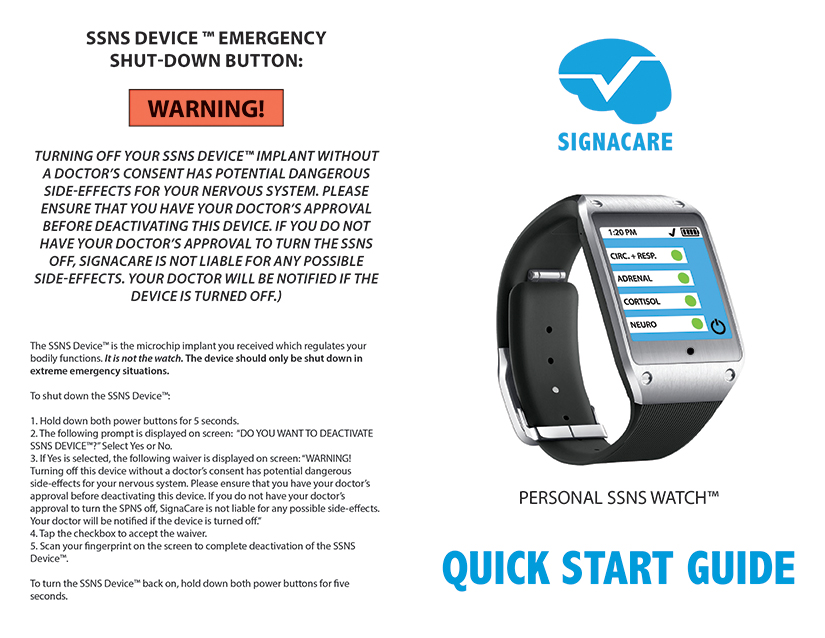
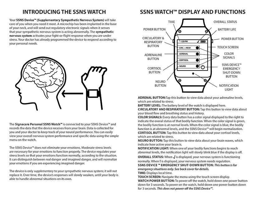
We understand that the idea of having a device in your body that can alter your bodily functions can be unsettling to some users, so we gave users the option to deactivate the microchip through the watch. However, like stopping any other medication, this can be dangerous for patients, so the user must follow a strict procedure to turn it off. The watch also notifies the doctor that the chip has been deactivated.
To ensure that the patients’ safety and health cannot be compromised, the watch and chip cannot be networked to other devices. The chip does not need the watch to function, so that if the user is ever separated from their watch, or has it damaged, the functional piece stays intact. The system is not an app that can be downloaded to any smart watch; the watch is a medical accessory created specifically for the system.
People with visible medical accessories can be discriminated against, whether on the street or in the workplace, so we wanted to make the watch as covert as possible. We emphasized that the Signacare Watch would be designed to look like any other smart watch at a glance. In addition, turning on the view would first lead to a decoy view resembling the default display of other smart watches.
The system represents highly personalized medical care, going beyond the individual patient and extending to the “doses” themselves. The chip stimulates or inhibits the body’s own production of chemicals, so that no foreign chemicals are introduced to the body.
But prolonged use of any medicine makes it less potent, so we designed the watch with a rehabilitative nature in mind. The notification light on the watch is designed with the hope that patients would learn to recognize and anticipate when their stress levels were rising and attempt to manage their reactions.
COURSE: Ambient Interface: Image and Interactivity
PROJECT DURATION: 8 weeks
ROLE: Interface, Interaction, and Visual Designer
In addition to participating in conceptualization, I was responsible for the final interface design, the presentation, user guide, demo video, and branding.
A little over a year later, I revisited this project. Although the project course emphasized the interactions over the interface, I since came to realize that there are many flaws in the interface. Overall, the redesign is simplified, enables more flexibility, and more aesthetically developed.
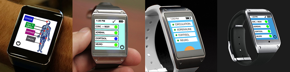
For example, the first iteration of the home view was designed with various biological stress indicators, and all iterations after followed along the same lines. This home view would not have been very helpful because:
The deactivation button also feels more prominent than necessary, since it is the only other button on the view.
With these criticisms in mind, I redesigned the home view with just a single indicator of general stress levels, accompanied with a textual cue. This way, the user is not bogged down with unfamiliar biological terms, and they do not need to worry about the significance of one indicator over another. I also added a navigation bar at the bottom so that the various views within the system are clearer and more accessible. The navigation bar consists of the decoy view, the home view, the stress tracker, and the deactivation button, giving spatial prominence to the views that the user is more likely to use.
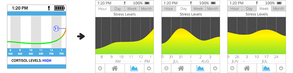
As for the stress tracker/history view, I added tabs at the top so that the user can easily view their record over different time periods, rather than being stuck with a single hourly view. The additional options would enable the user to examine their progress over time on their own, without needing to consult their doctor for the information.
With the old prototype, the view would indicated whenever calibration was taking place. However, there was no way to tell how long the calibration would take, or a way to exit that view. In the redesign, rather than having it's own view, the calibration notification simply pops up over the current view as a modal, which the user can easily dismiss if they choose.