Graphic Design, Illustration
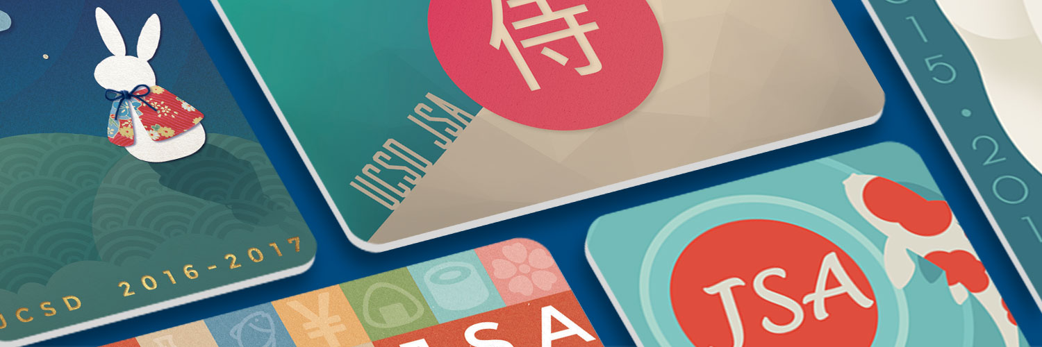
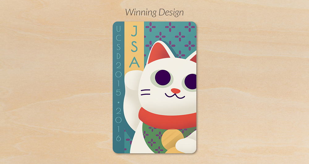
Each card was designed to reflect a different feeling. However, all cards use a traditional Japanese color palette and motif. The central motifs and layouts were chosen before I began arranging colors.
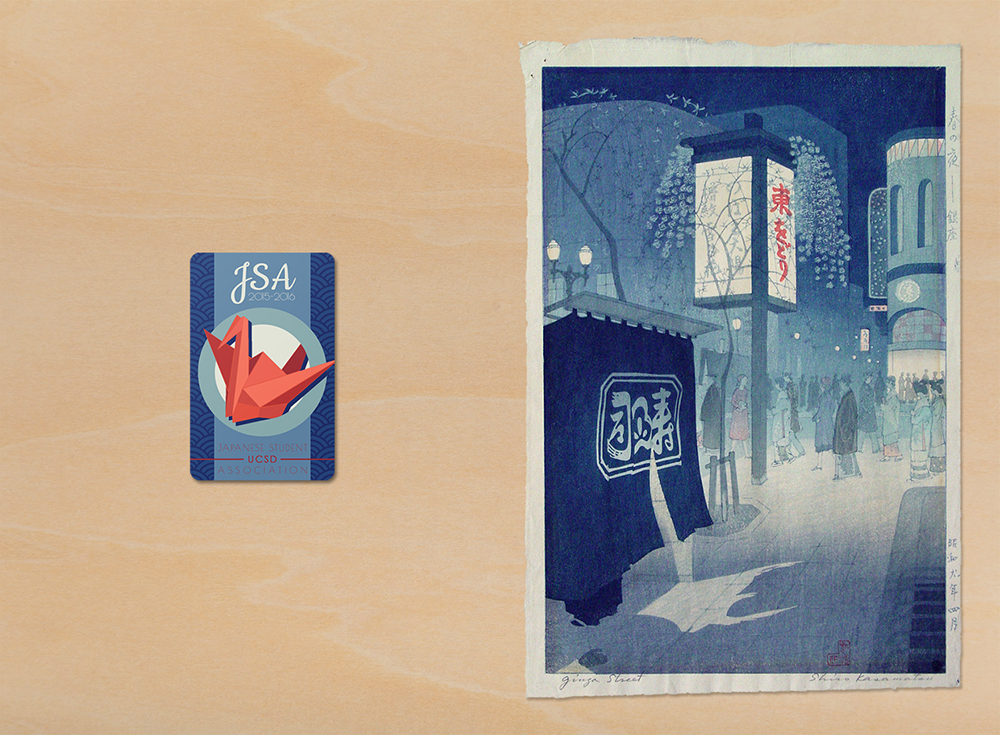
Inspired by "Spring Night at Ginza" by Kasamatsu Shirō, 1934.
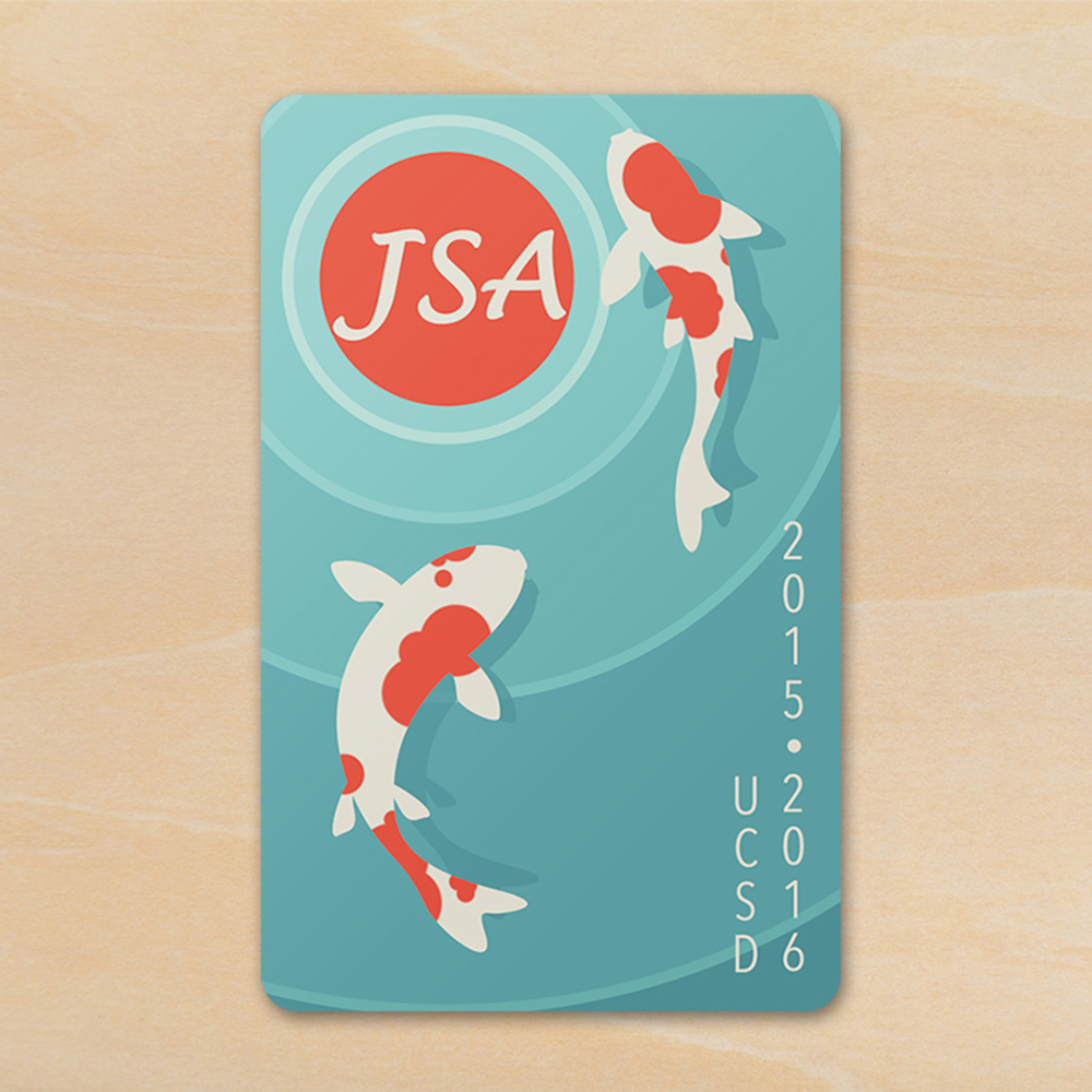
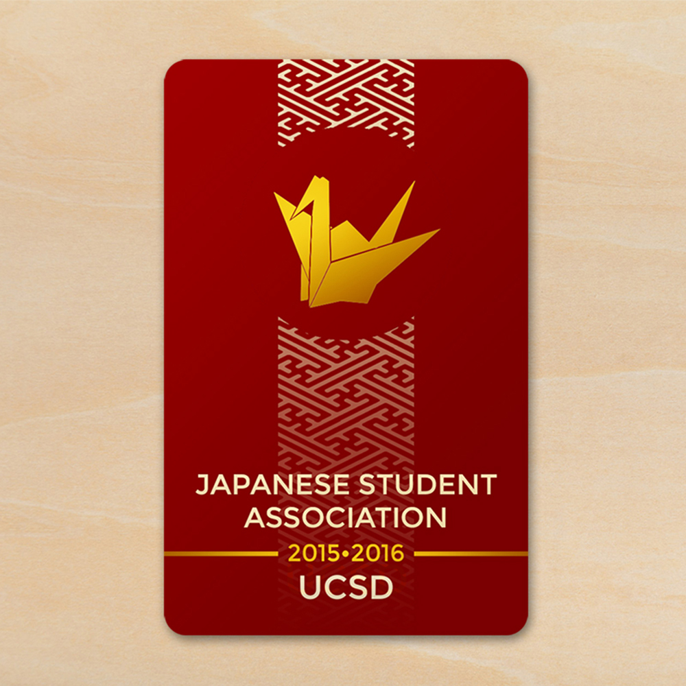
Although I had already graduated, JSA asked me to participate in their contest again. Like last time, I was heavily inspired by traditional Japanese color palettes and some Japanese motifs. But I also pushed myself to experiment with textures, aiming for a more complex visual effect.
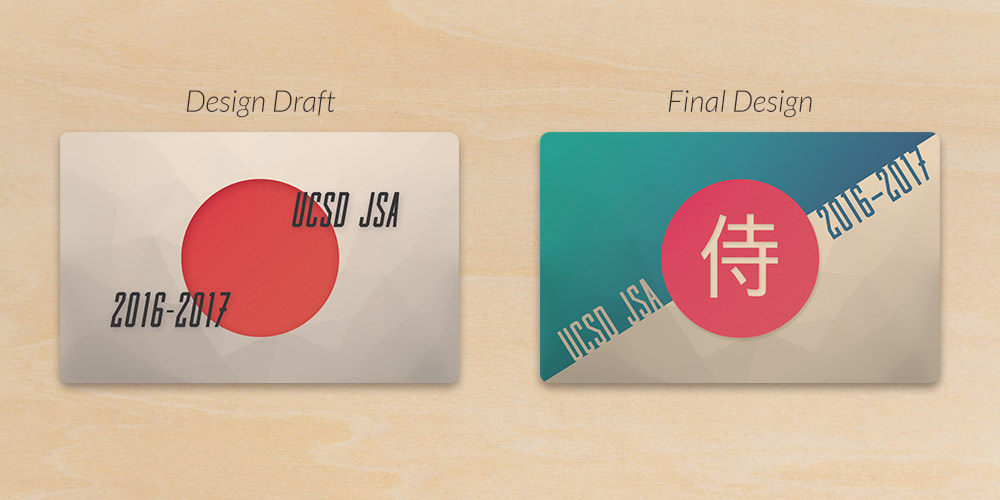
The inspiration for the first design came to me as I was looking at the side of a Portillo's diner. The red circle reminded me of the Japanese flag, and combined with the steel pattern and black lines, I felt it was a very striking design. However, it didn't translate as well when I was trying to place the text, and so the card design evolved into something else.

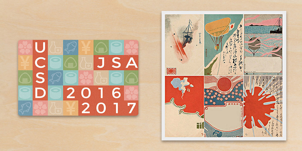
The second design was inspired by a set of vintage Japanese postcards.
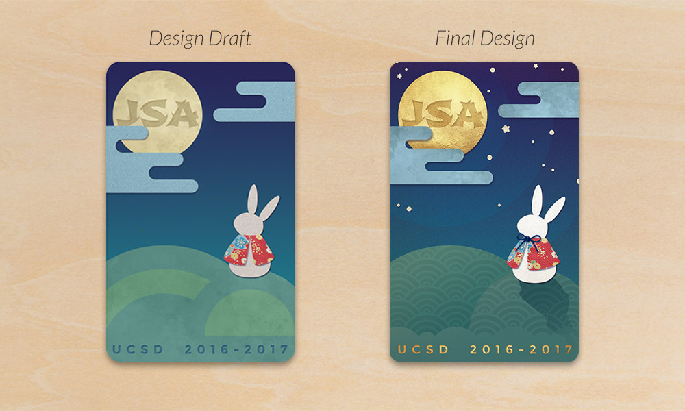
The final design, and my personal favorite, was inspired by the traditional Japanese legend of a rabbit in the moon. Instead of a man in the moon, ancient Japanese supposedly saw a rabbit pounding mochi. I wanted to include the mochi-pounding element, but opted for a subtler allusion in the end.
I wanted to incorporate as many textures as I could—as long as they added to the design instead of detracting—but also experiment with a cut-paper look. I was rushing to finish the design before the deadline, and I wasn't nearly satisfied with the outcome. I asked for a short extension and revisited it just a few hours later, and the result was a much more refined design.
