UX, App Design, Visual Design
Many matchmaking apps require users to sort through dozens of profiles to find someone compatible, which is a time consuming process. In addition, they’re usually aimed towards creating romantic connections rather than friendship.
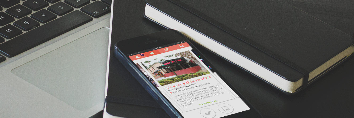
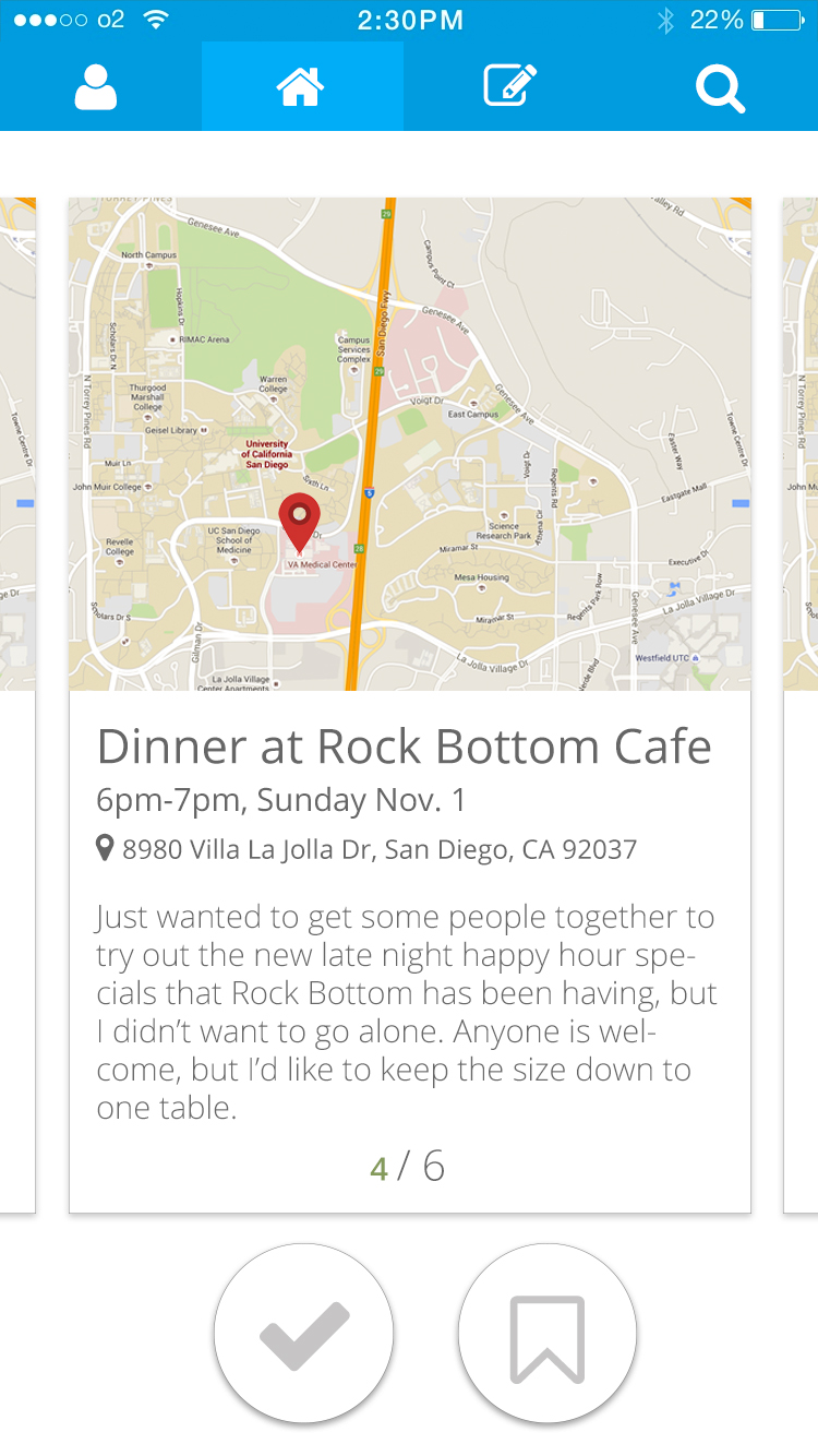
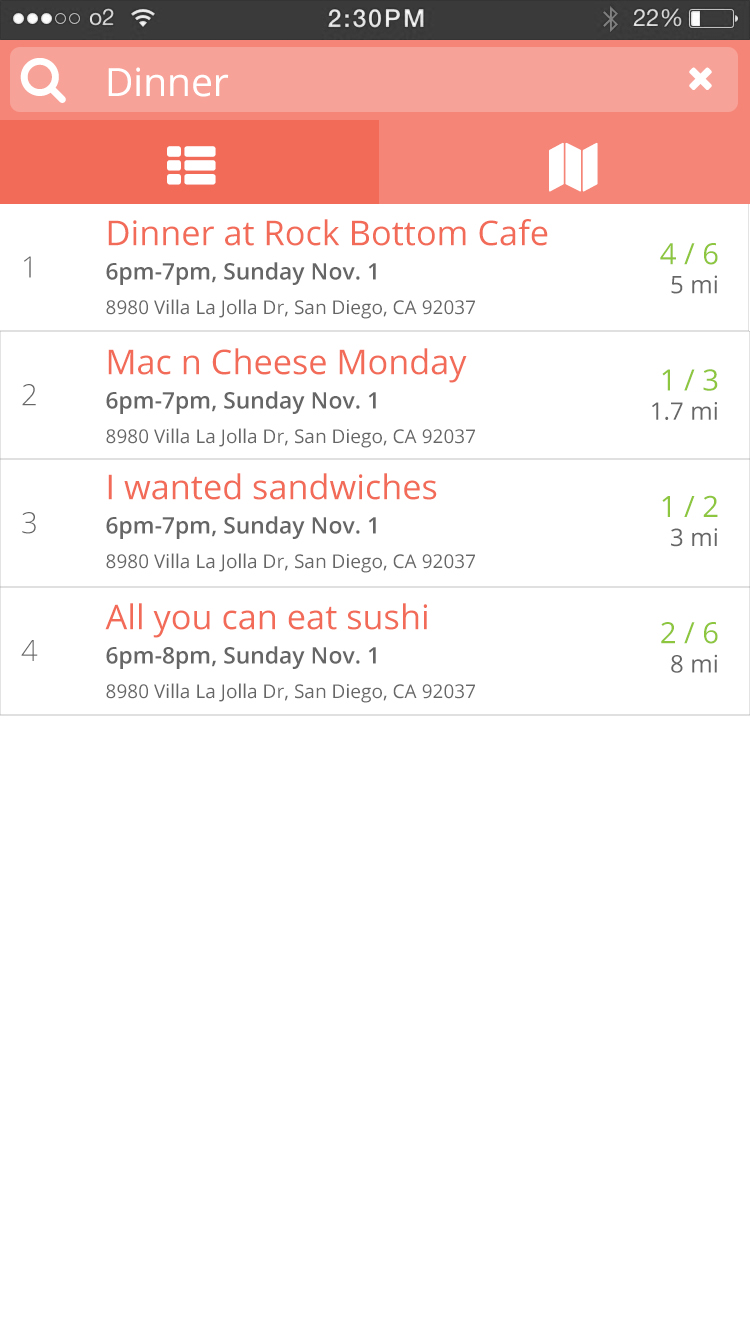
Mingo presents users with an event feed, through which they can view and RSVP to social gatherings created by other users. By starting with a common interest and an pre-organized meet-up (dinner at a favorite restaurant, happy hour at the bar, yoga in the park, etc.), users can bypass the lengthy process other apps require in order to meet people.
When we were first brainstorming app ideas, one of the concepts that came up was “Tinder-Yelp”—basically, it would be an app to help hungry yet indecisive users decide where to eat, Tinder-style. After more discussion, we decided to pursue something along the same lines—a matchmaking app based on locational interests. It seemed appropriate to today’s society, where many young people are meeting others online.
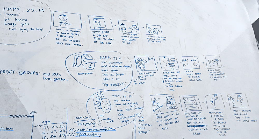
We created storyboards and personas to determine who our target market would be and how our app would impact their lives. Because college students are a large market for contemporary matchmaking apps, and because they were our most relatable demographic, we decided to focus on them.
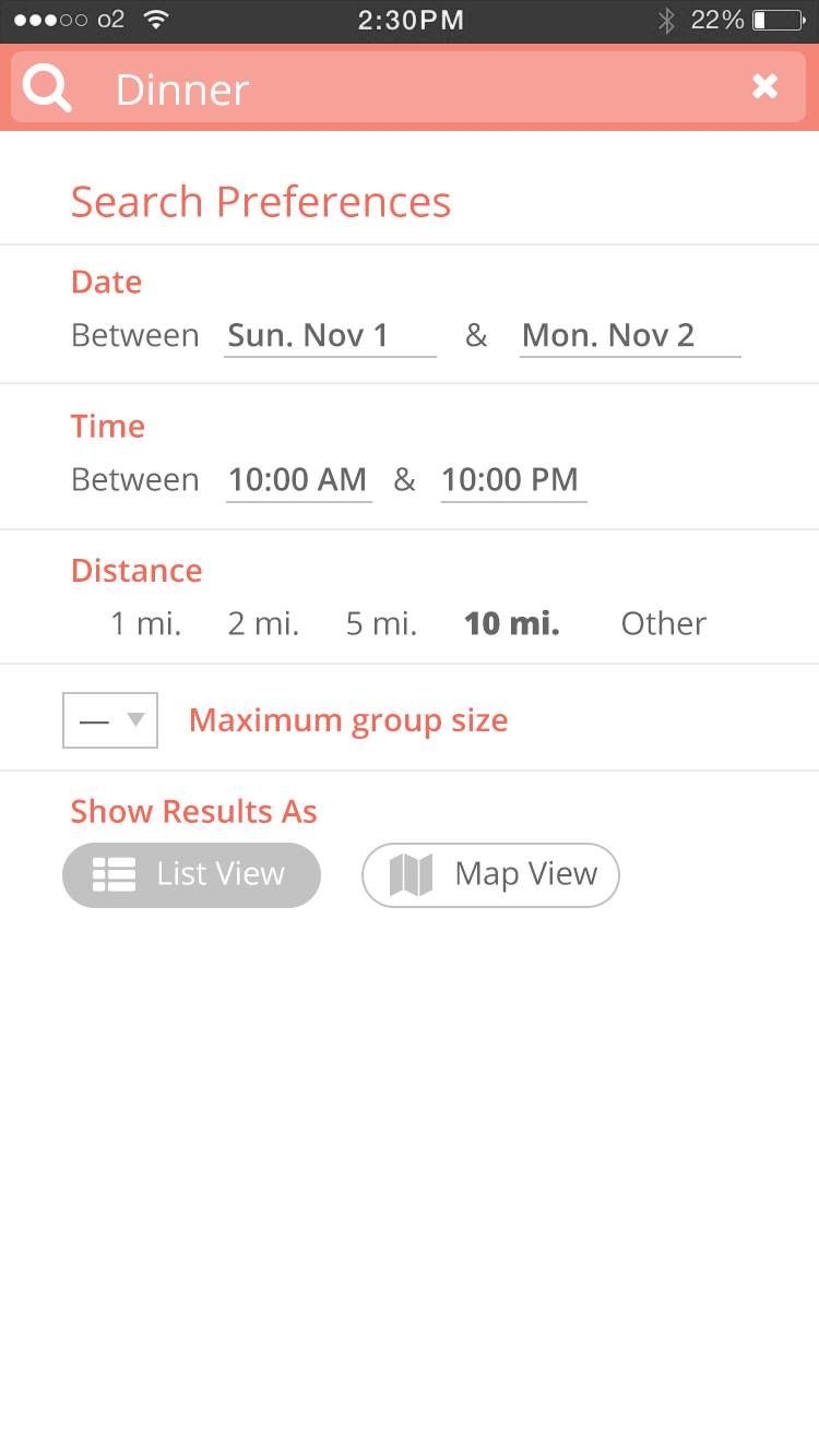
We each conducted our own user research through interviews with friends and colleagues to determine how people interact and make friends, adding onto and revising our current understanding. Overall, there seemed to be a lot of varying concerns, such as security, location, and cost. With our gatherings, we carefully considered what sort of features our app should include, such as a map display, chat system, and different types of hangouts based on relationship goals.
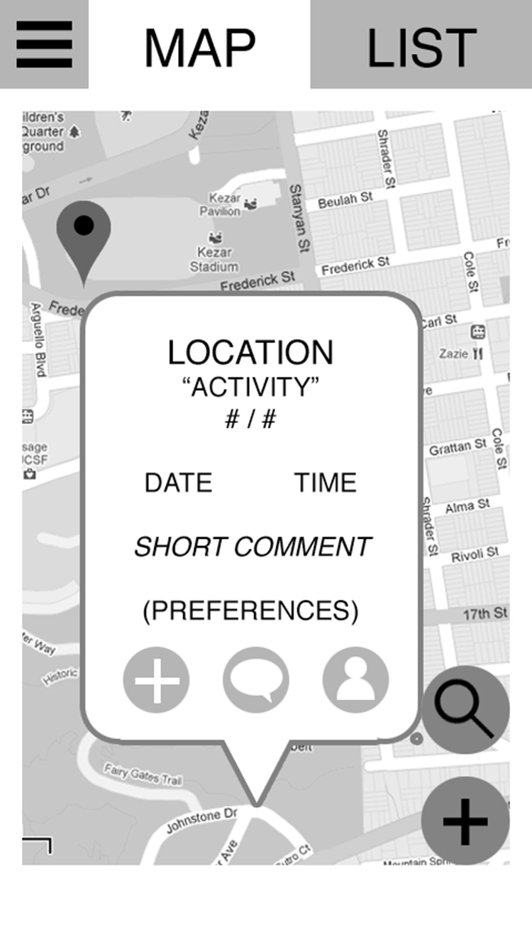
With these ideas, we all sketched out individual wireframes, and heuristically comparing them. We identified interface patterns and missing features, narrowed our focus, and finally produced our first prototype.
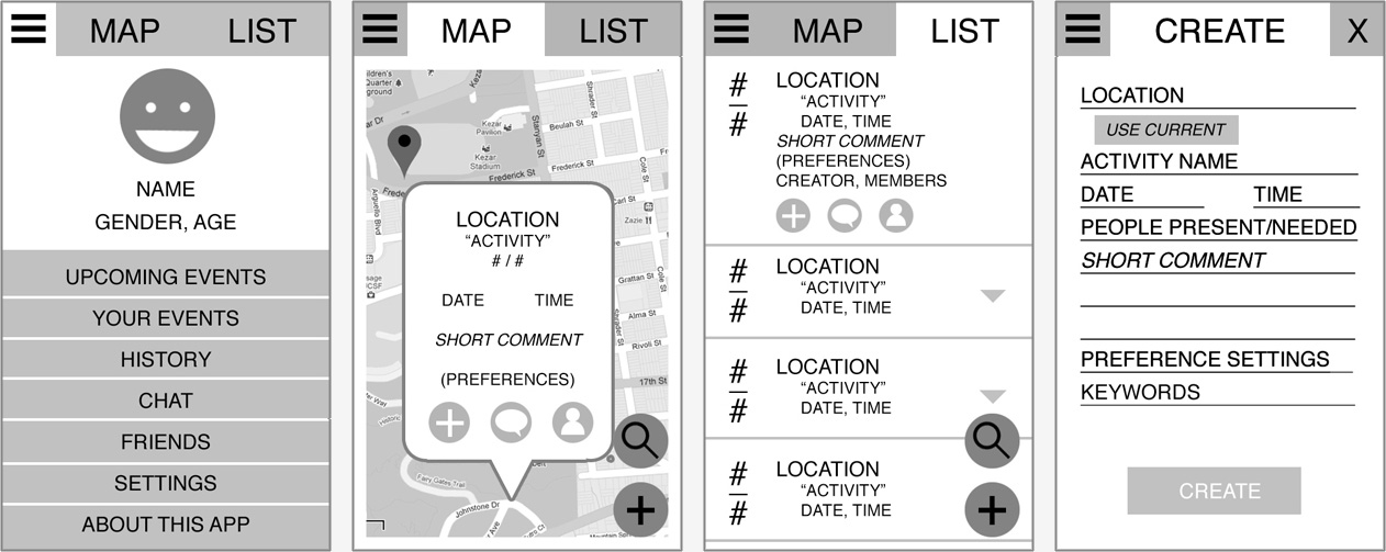
Our first prototype was stripped down to the essentials so that our testers could focus on the function and organization rather than aesthetic.
We identified a lot of issues through user testing, such as the practical scope of use, misunderstandings of certain features, and even missing features. Since we were making a lot of changes to our app, we updated our storyboards and personas to redefine our vision and purpose.
There was significant debate over how we should enable users to communicate with each other, and we decided to limit communication to within events. The comment section was divided into a public and private section, with the private section only visible to attendees. This re-emphasized our focus on building relationships through physical event interactions, rather than online chatting.
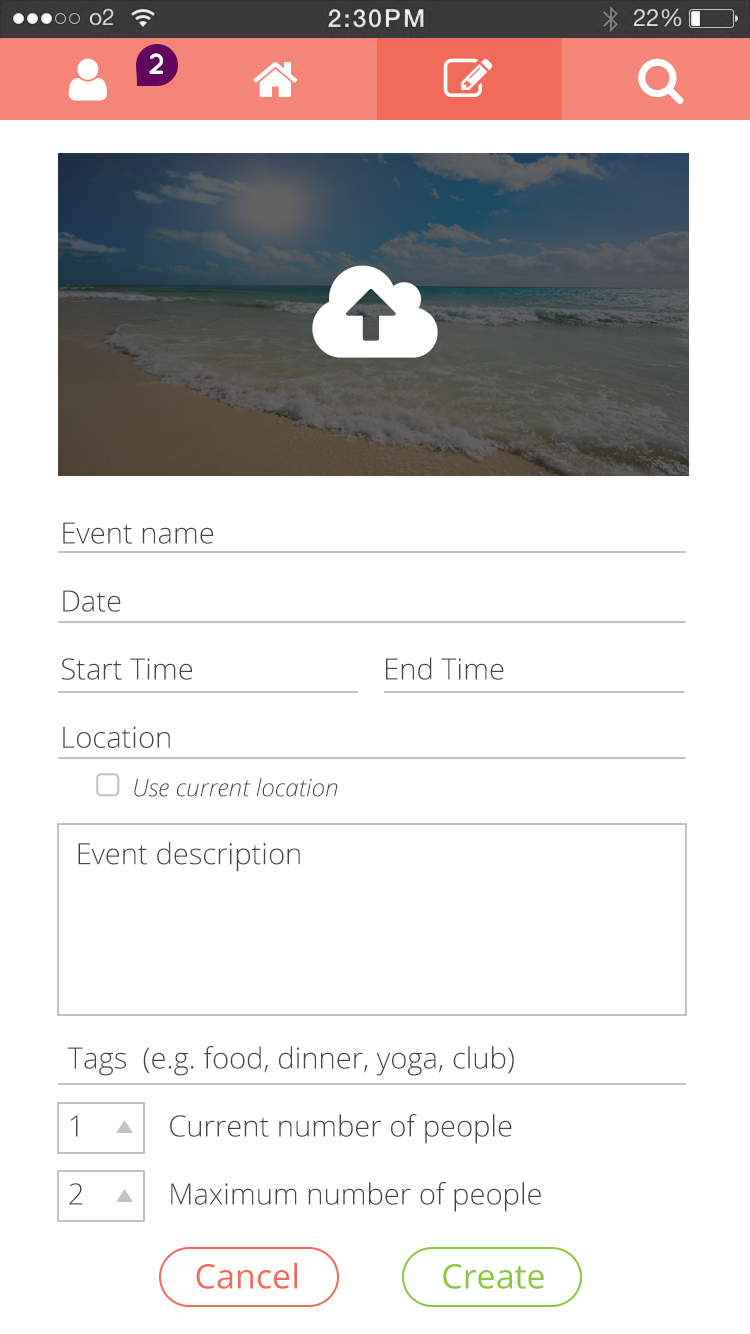
We originally wanted the app to include events within a broad time frame, letting users create events planned for that day or perhaps a year later. Due to feedback, we limited the time frame After testing, we limited the time frame so that users could only create events that would take place within the next week. This emphasized the quick, efficient, yet spontaneous nature of the app.
As with any app that involves meeting up with strangers, security was a recurring concern. Although younger people are more open to the idea, thanks to apps like Tinder and AirBNB, there were still important measures we needed to take. In addition to standard flagging and blocking options, we chose to hide users’ event from each other to prevent suspicious users from tracking others.
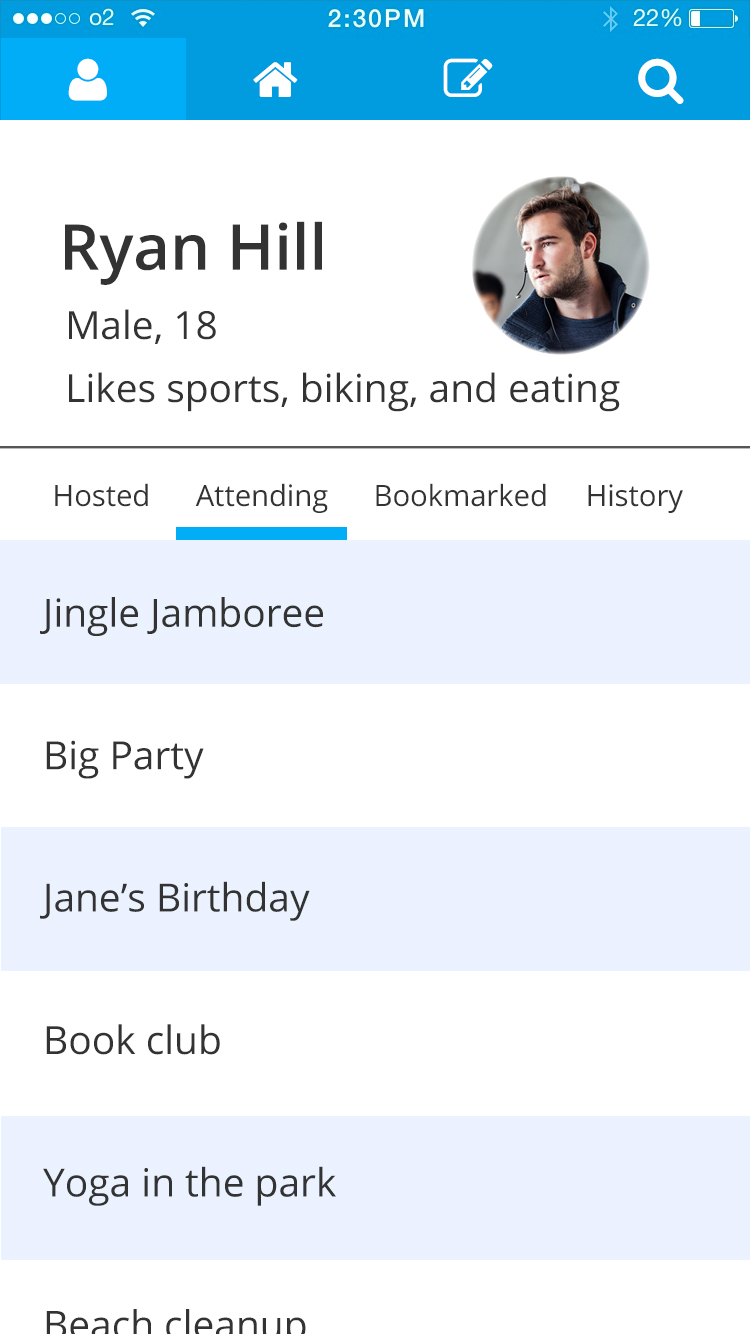
Ryan created our next prototype, complete with an InVision demo, just in time for another round of user testing. This time, we received a lot more positive feedback and there was much less confusion over the interface, indicating that we were heading in the right direction.
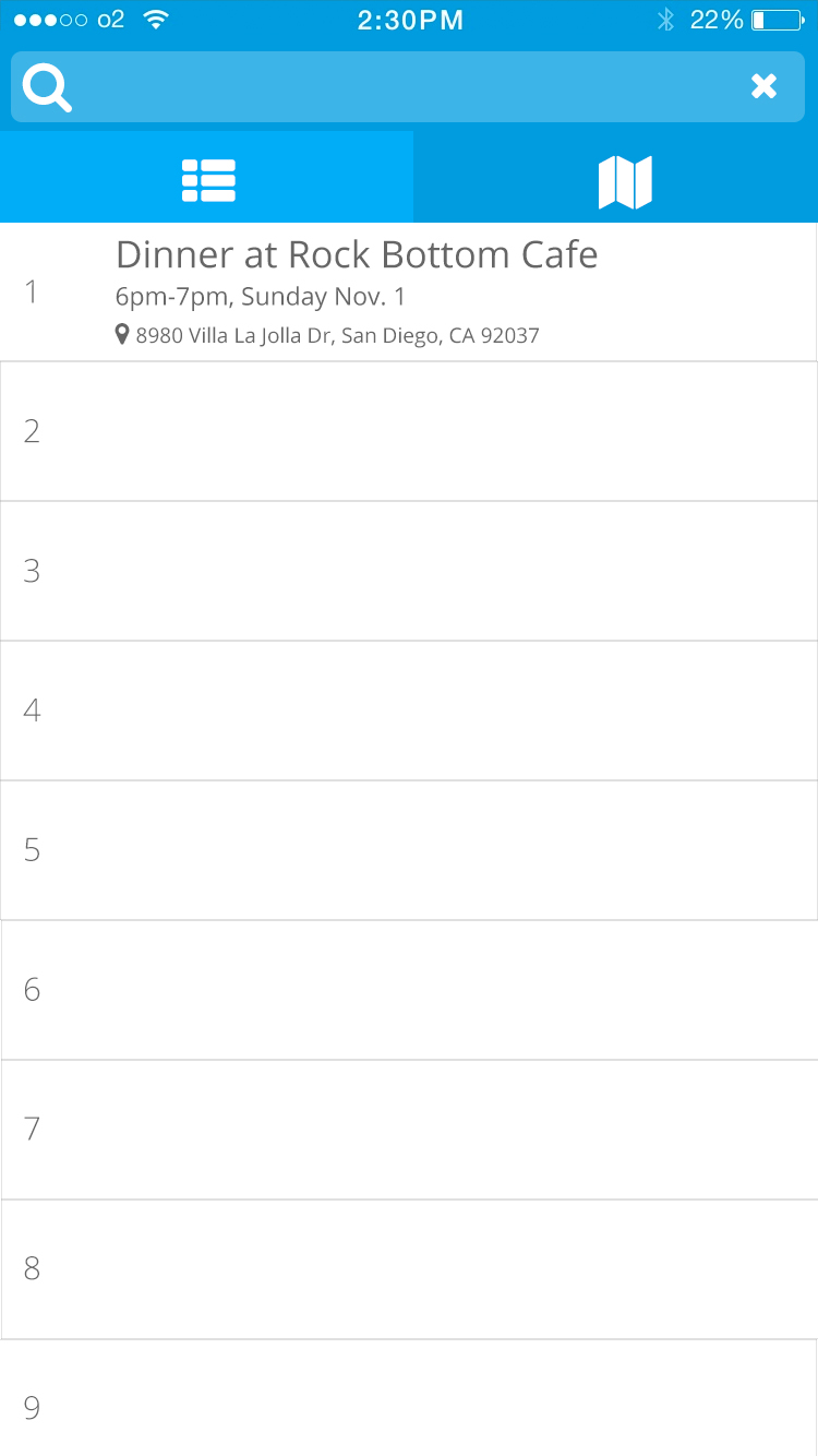
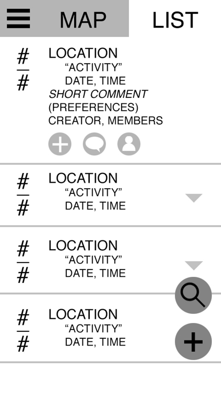
The event feed is the first thing the user sees when they open the app. Our first design let users choose between a map view and a list view. In our next iteration we used a card-based feed, with individual descriptions on each card. This made navigation more efficient by letting users browse events with just a swipe.
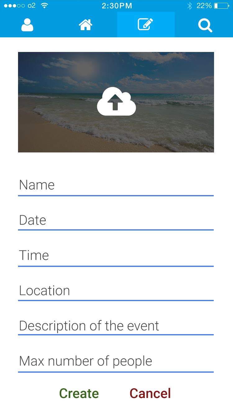
For the final prototype, we addressed all the issues found in our last round of testing. After Ryan set the standard for the visual design of the app, I incorporated feedback from user testing to refine the interface and improve the visual hierarchy.
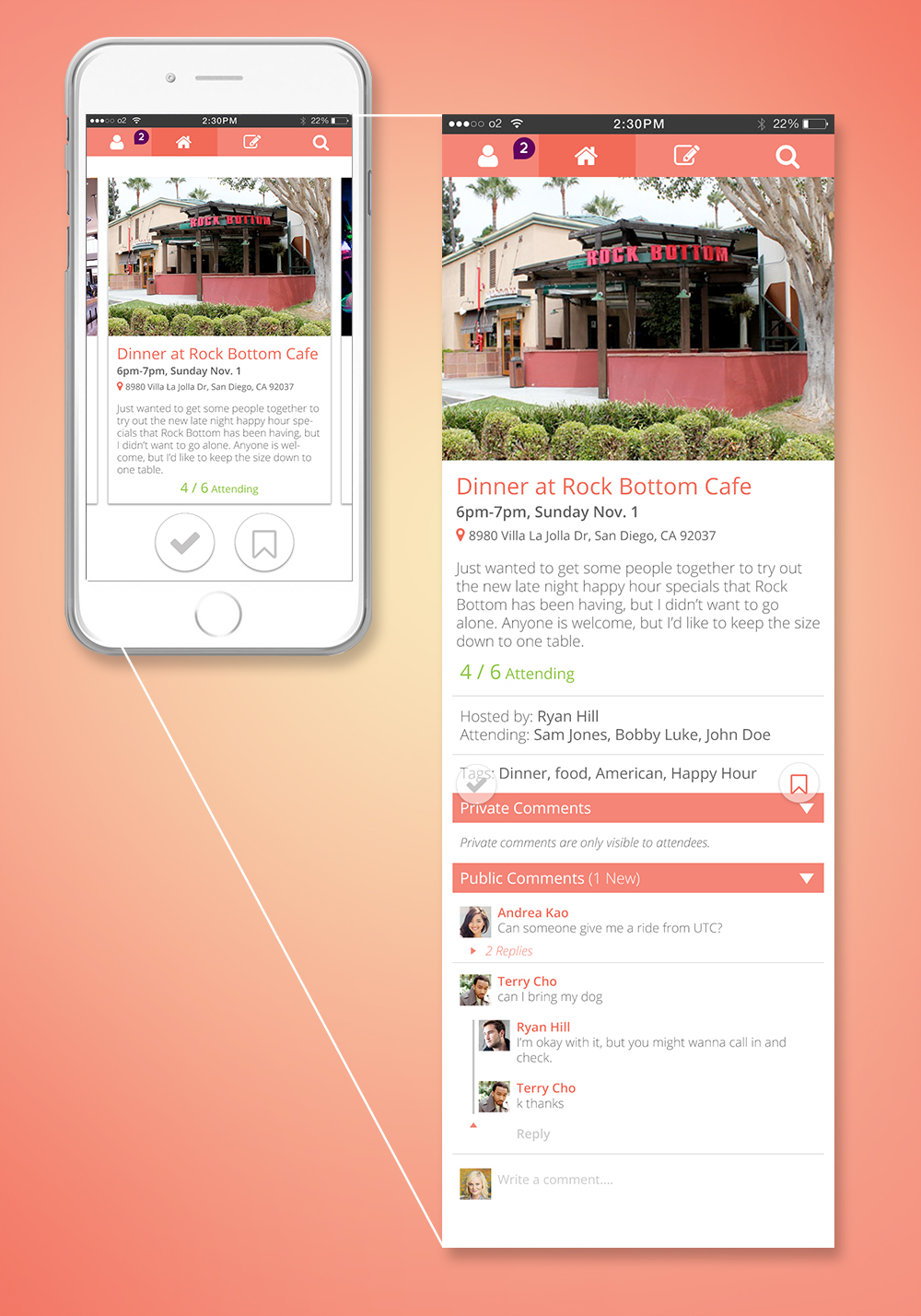
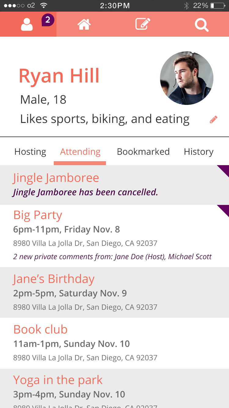
The home screen functions as a local event feed, organized as cards. Tapping on a card shows the complete event info.
COURSE: Usability and Information Architecture
PROJECT DURATION: 8 weeks
ROLE: UI/UX and Visual Designer
We couldn't decide on the name of the app until our 6th week together. Until then, we just called it "Stranger Meetup".