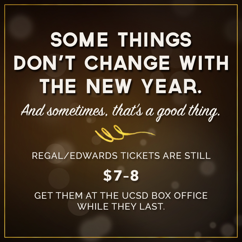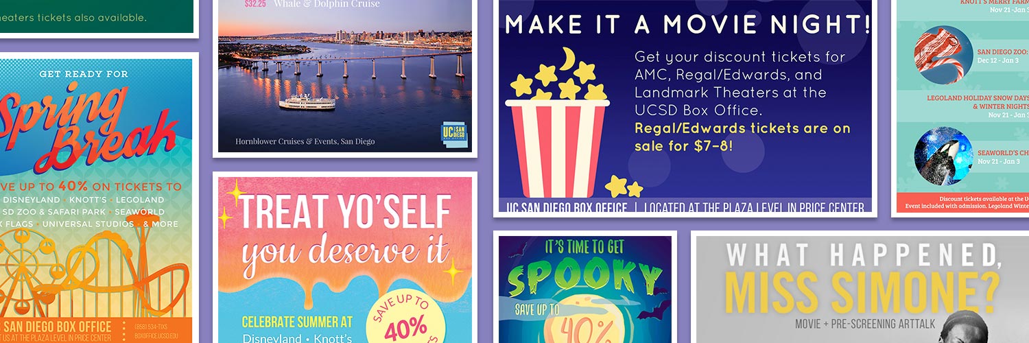
Graphic Design, Illustration, Advertisement
Every poster followed a similar process. Before I begin sketching out ideas, I look at numerous posters within that theme to get an idea of the motifs and colors typically used to promote the occasion. Afterwards, I sketch out multiple poster designs. I also consider possible color palettes and eventually decide on the best one for the final design. The more posters I created, the more I began to experiment with color and texture in my designs.
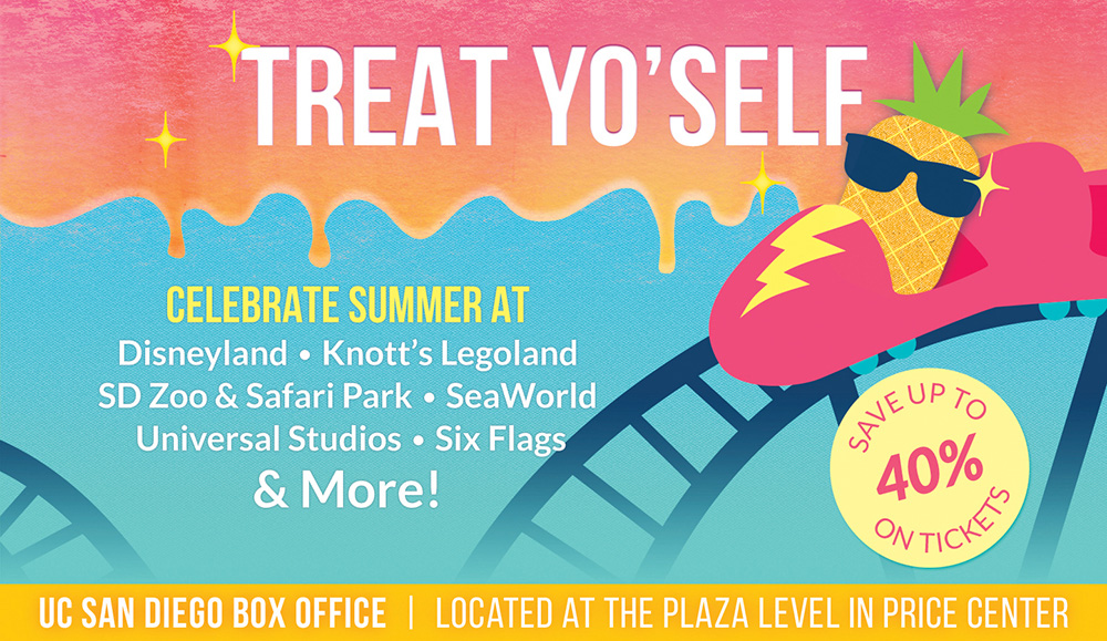
This poster was a unique challenge because it involved multiple third-party materials, namely, the logos of the attractions. I knew I had to design something that would allow enough space to clearly display the logos, but somehow unify them into an appealing graphic. The final layout is successful because it draws attention to a benefit to consumers without overshadowing the actual offerings.
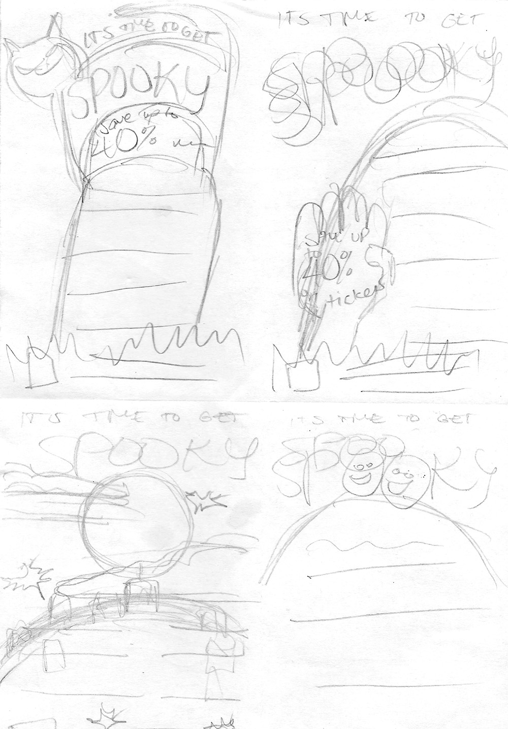
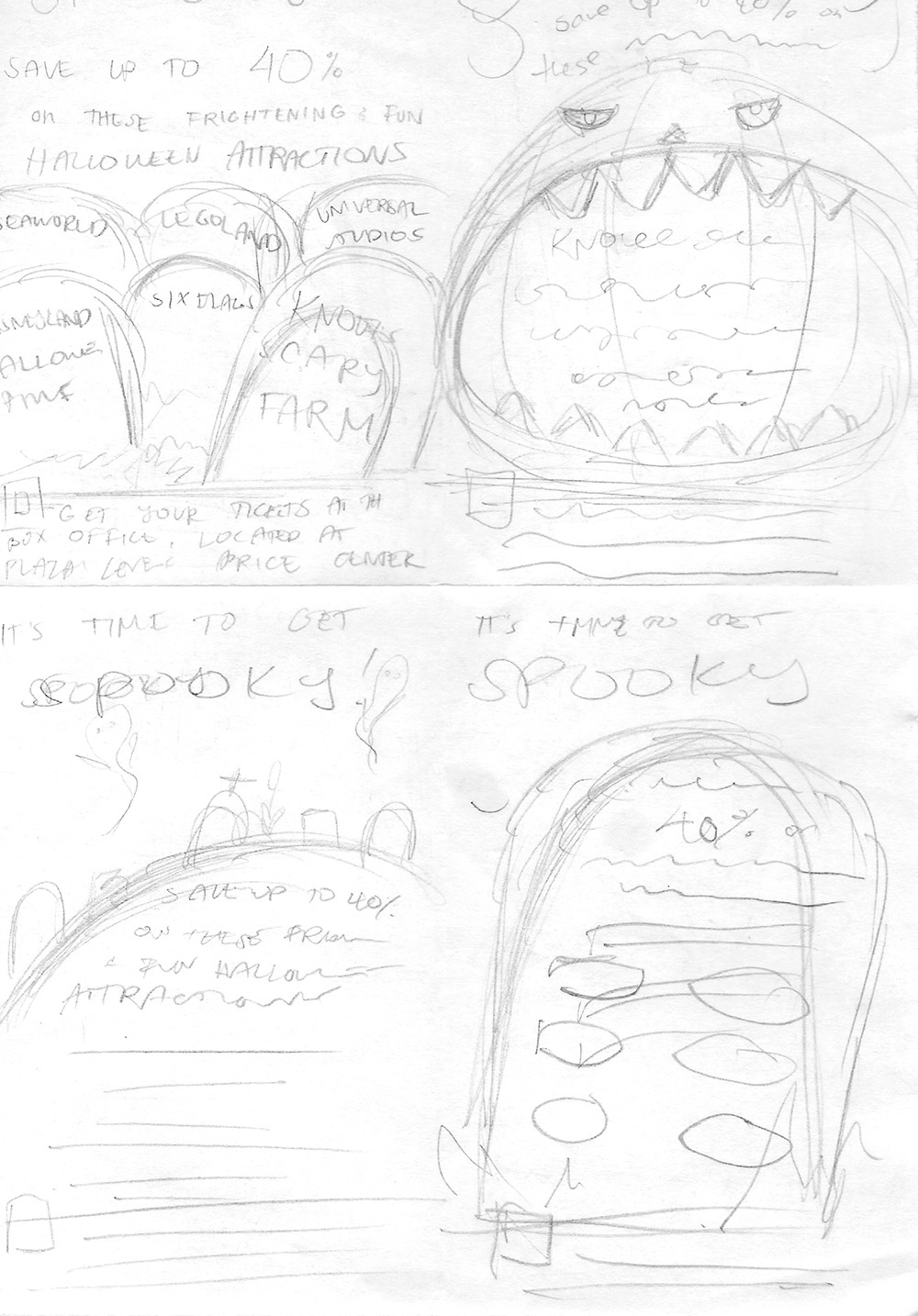
In my sketches, I experimented with the arrangement of information.
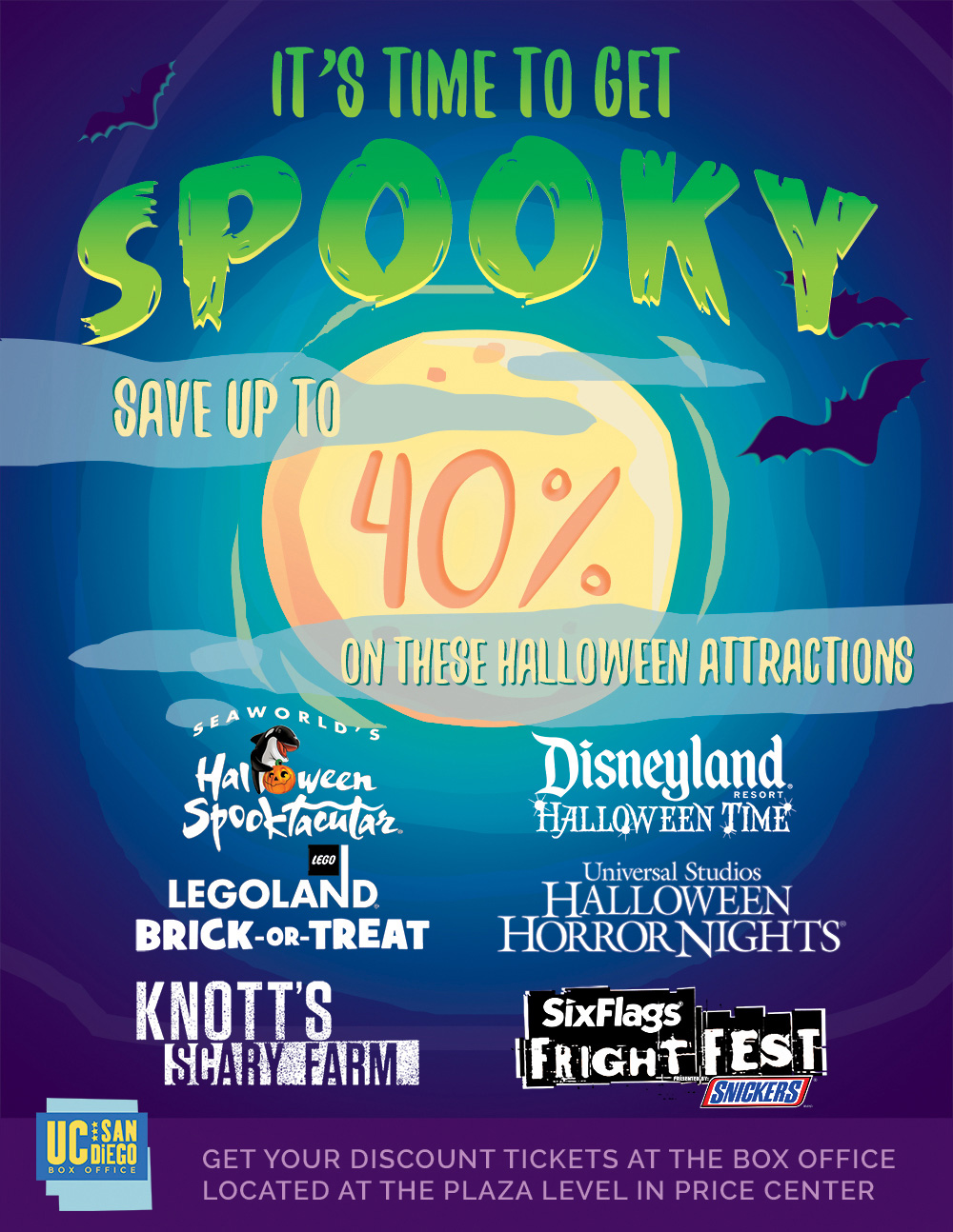
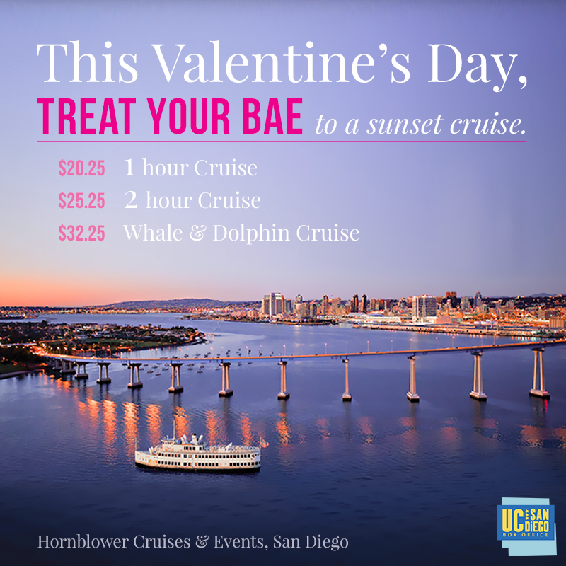
The final poster design.

I also created a version for use as the Box Office's Facebook cover.
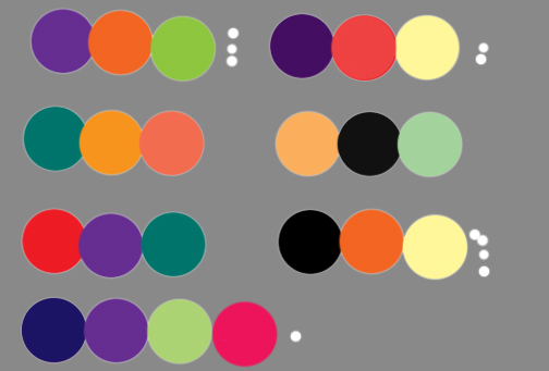
Other color palettes I considered.
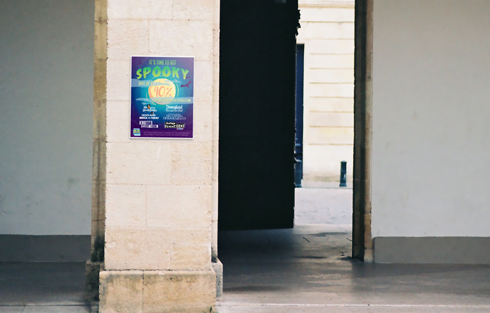
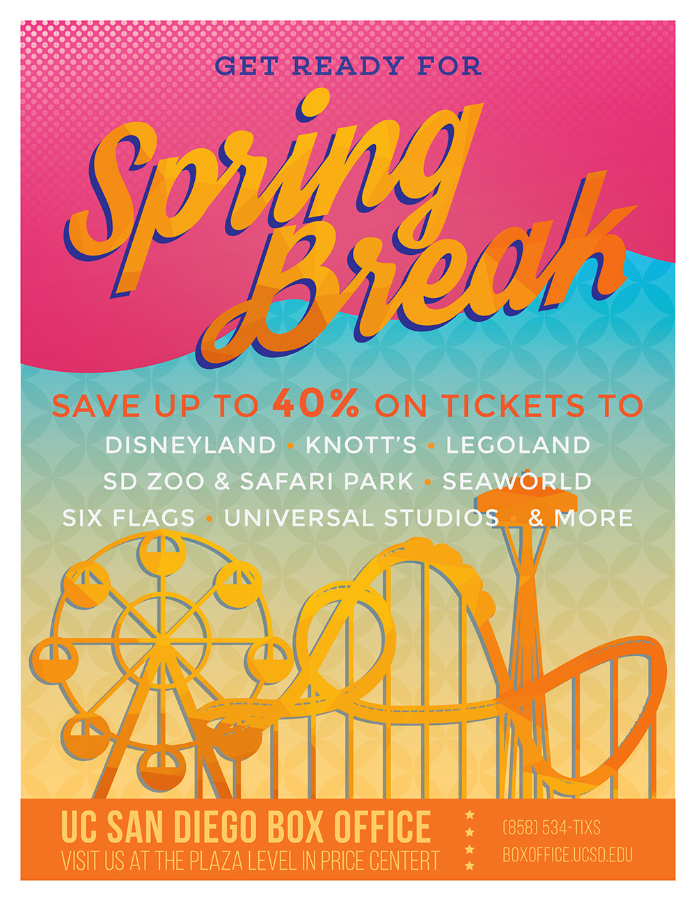
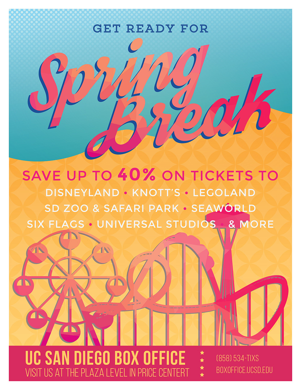
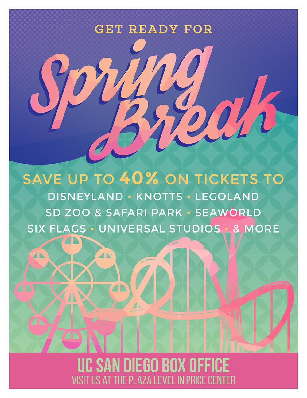
Other color palettes I considered.
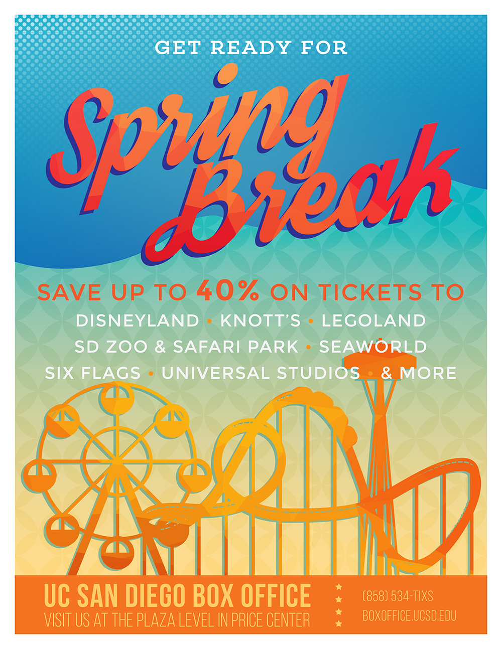
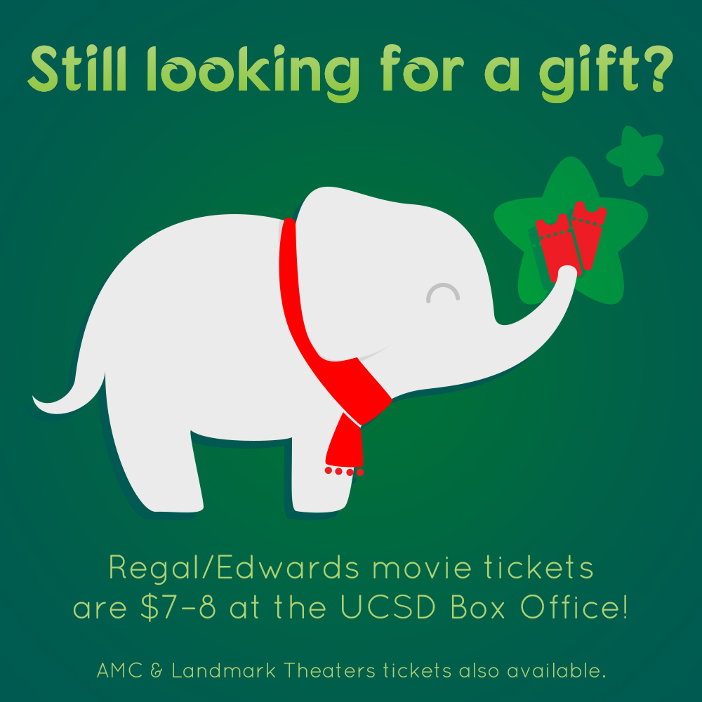
The final design.

One of the final drafts.
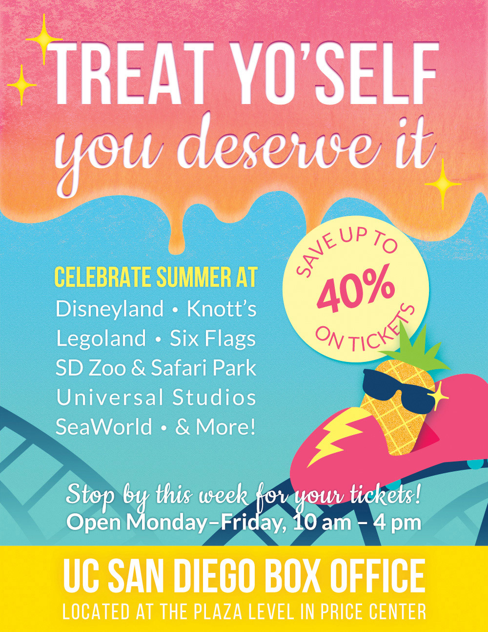
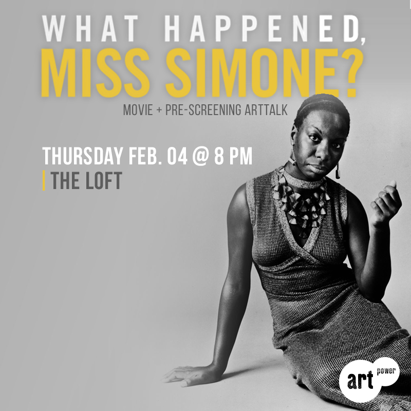
The final design, with improved colors and textures.
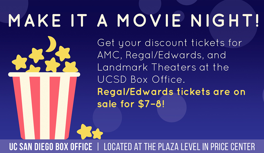
A wide version for TV display.
