Art Direction, Graphic Design, Branding
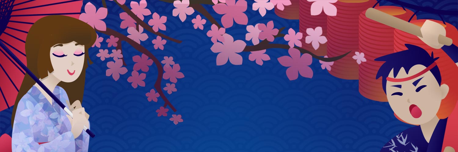
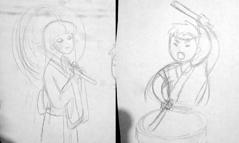
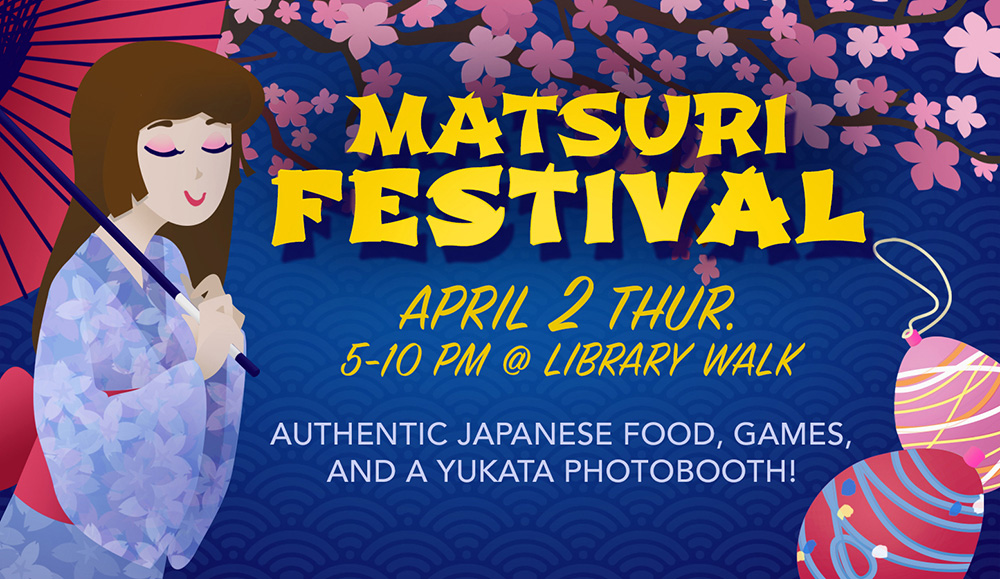
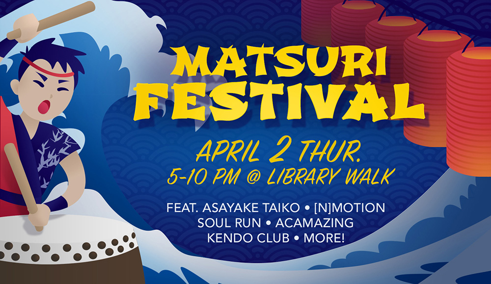
As usual, before I began designing, I looked at a myriad of other posters for inspiration and to understand how promotional posters are usually laid out. I drew multiple sketches, and decided on a frame of various Japanese cultural elements that would be at the festival. I organized the elements so they would lead the eye in an near-circular motion around the poster. At the center of the circle lies the information. I chose a Japanese color scheme and reserved the brightest color for the center, so the information clearly pops against the background.
The drummer's uniform is based on the actual uniform of the UCSD Asayake Taiko team, who performed at the festival. The yukata worn by the woman is based on a yukata I wore at the festival in 2012, when I first went.
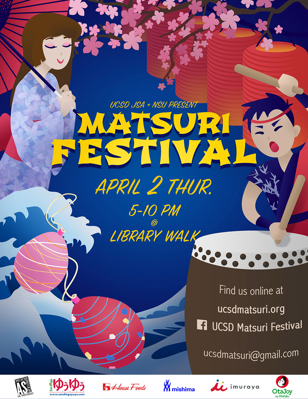
Final version of poster, with water balloon yo-yos.
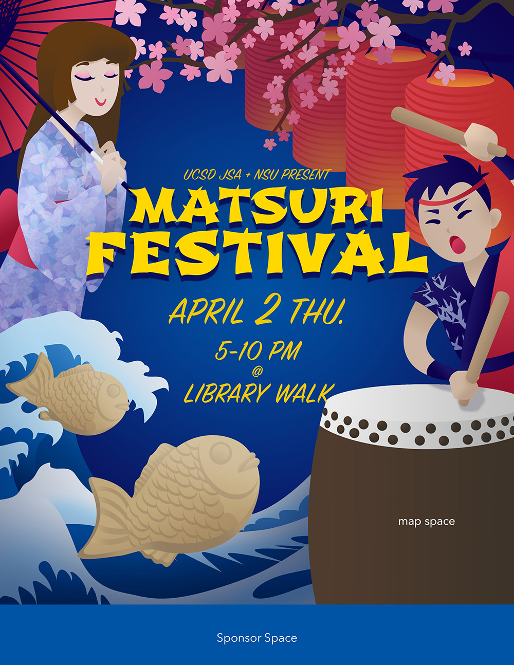
Initial version of poster, with traditional Japanese pastries.
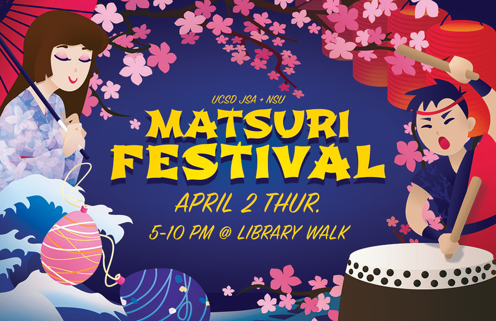
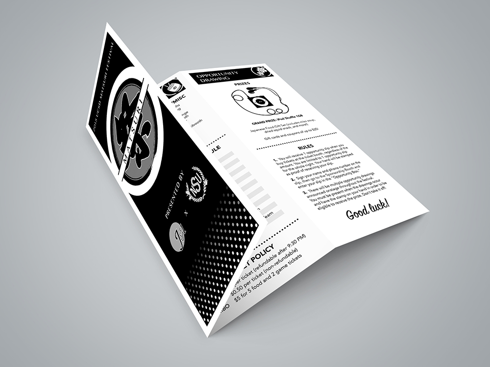
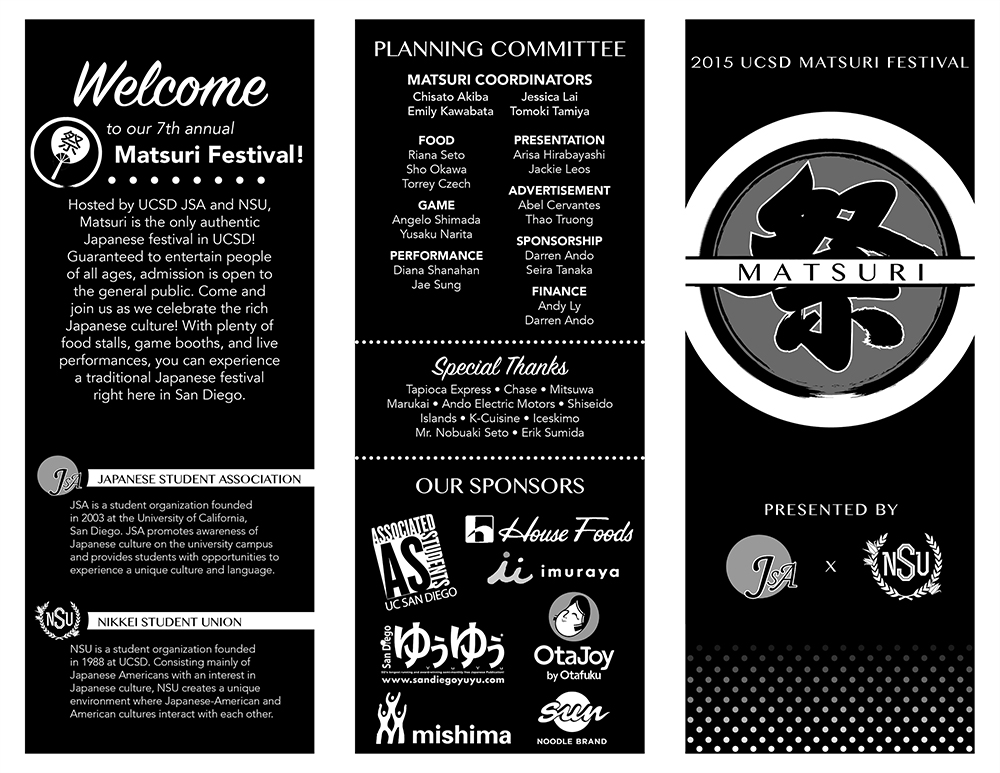
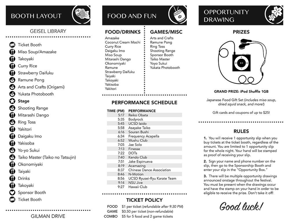
The cover of the brochure needed to feature the Matsuri logo, which was designed by someone else. However, I tried to design the brochure to appear stylistically similar to my poster, since the poster was the basis for all the previous promotional materials. I wanted to ensure that all the graphic pieces of the festival were visually consistent.
