UX, Web, Visual Design
Saving money for a goal can be difficult for young people just getting into budgeting, because it involves complicated calculations and lots of numbers to keep track of. It is can also be incredibly dry and boring, so people may not enjoy doing it.
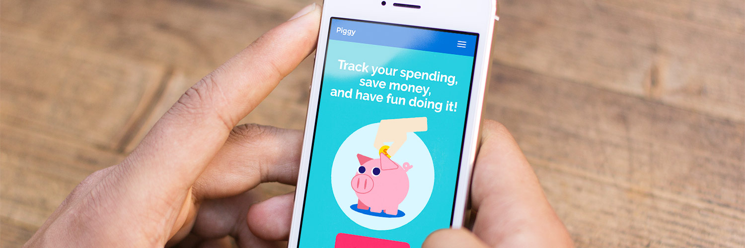
Piggy simplifies the saving process by doing all the calculations and providing users the necessary tools to keep track of their spending. It informs the user of their financial situation and motivates users to consistently spend less by rewarding them when they follow their saving plan. It sets a concrete and manageable goal that users can easily work towards.
For eight weeks, I worked within a small team to design, develop, and test the Piggy mobile web app. The project began with needfinding exercises about resolutions, through which we determined to address budgeting. We then created inspiration boards based on traits we wanted our app to be associated with (fun, rewarding, self-awareness, etc). The board consisted of apps with these traits and functions, and how we saw them as relevant to our own idea. We asked other students how they attempted to save money, and also tried out a number of financial apps to identify design patterns and necessary functions. It was important during the research phase that we got an accurate idea of how people budget in order to solve the issue.
We created storyboards and paper prototypes to explore our target market and different solutions to our problem. The storyboards walked us through the overall experience users would have before, during, and after using the app.
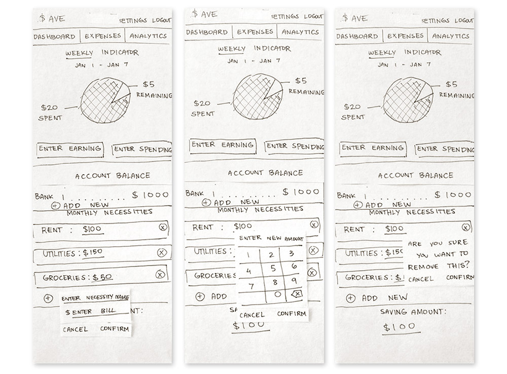
Our paper prototypes were comprehensive—they included every dropdown menu, modal window, and all other click responses for each page on the site.
Our prototypes underwent heuristic evaluation by several groups, and we corrected all identified issues. We then conducted competitive analysis of similar apps, such as Mint, Monefy, Expensify, and Level, to determine how we would differentiate our app, as compared to their strengths and weaknesses.
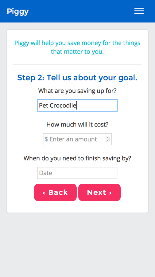
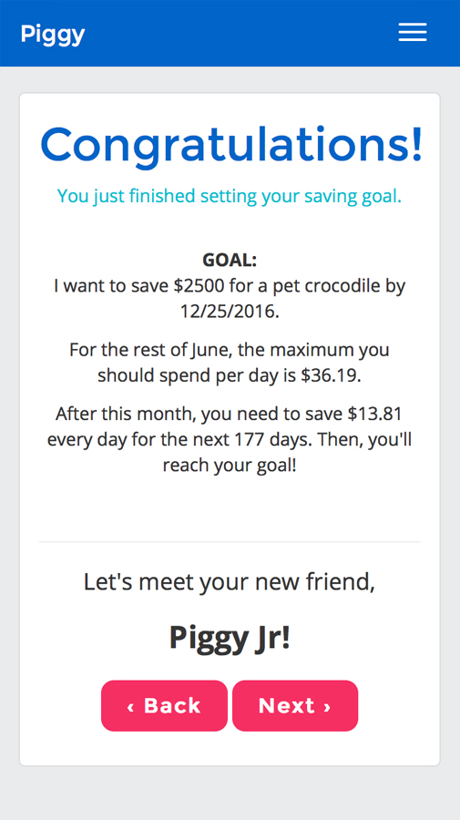
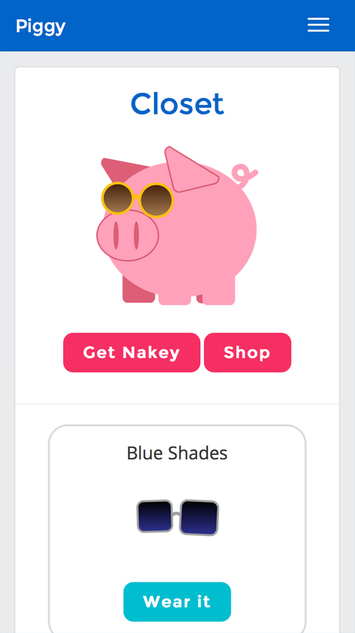
Piggy is optimized for younger users who may be new to budgeting. To appeal to this market, we used a simple, bright interface and a gamified saving process. Users are asked to identify a financial goal and deadline, and their progress is guided by the site. They are rewarded with virtual coins based on how well they meet their daily budget. The coins can be exchanged in the shop for items for their virtual avatar. The avatar and coins serve as one form of motivation for the user to continue saving.
We also targeted users saving for a short-term goal rather than a long-term one, for several reasons:
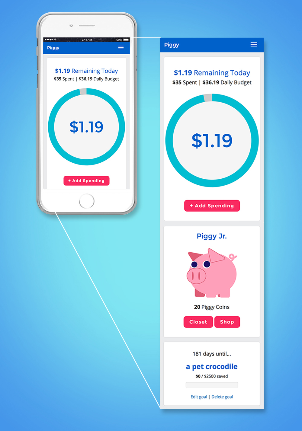
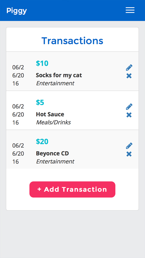
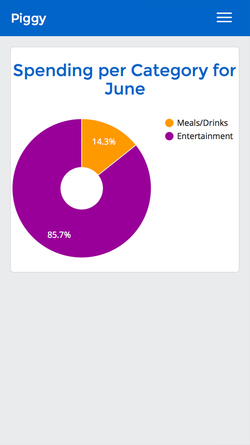
Components are ordered by what the user is most likely to want immediate access to. Because the purpose of the app is budgeting, the user's financial progress is displayed first. Users can view their allowance and make a transaction log without swiping around. The progress meter was saved for the bottom, since users need not refer to it as often.
It was really important to us that Piggy looked fun and inviting, since budgeting can often be seen as daunting, boring, or confusing and complicated. At the same time, it was important not to make it look too childish, or else it might also seem unreliable.
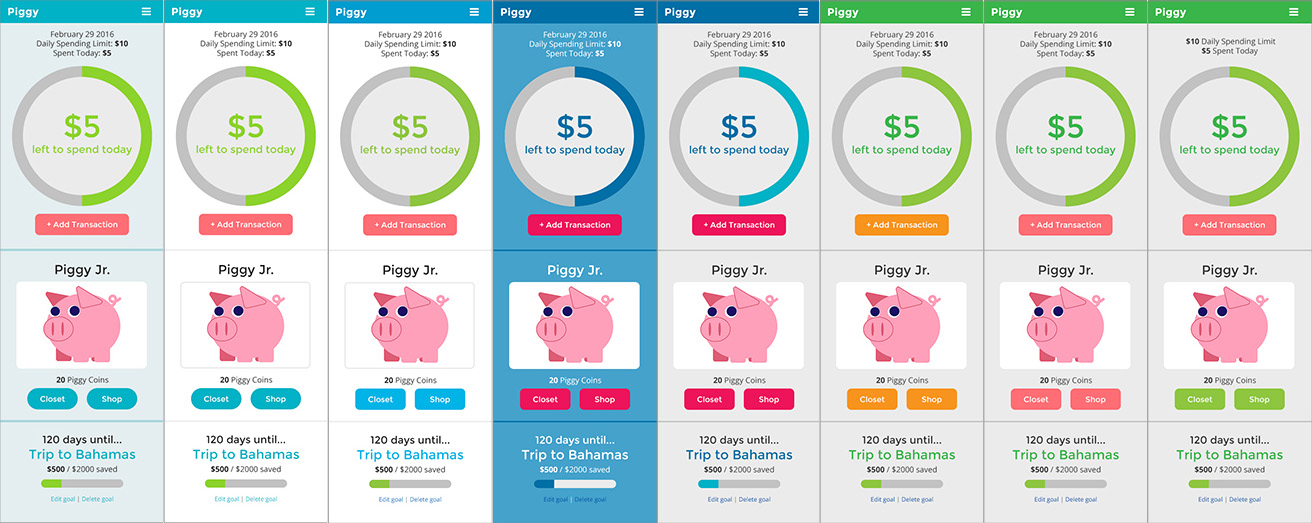
Exploring color schemes—I needed to strike a perfect balance between fun and reliable.
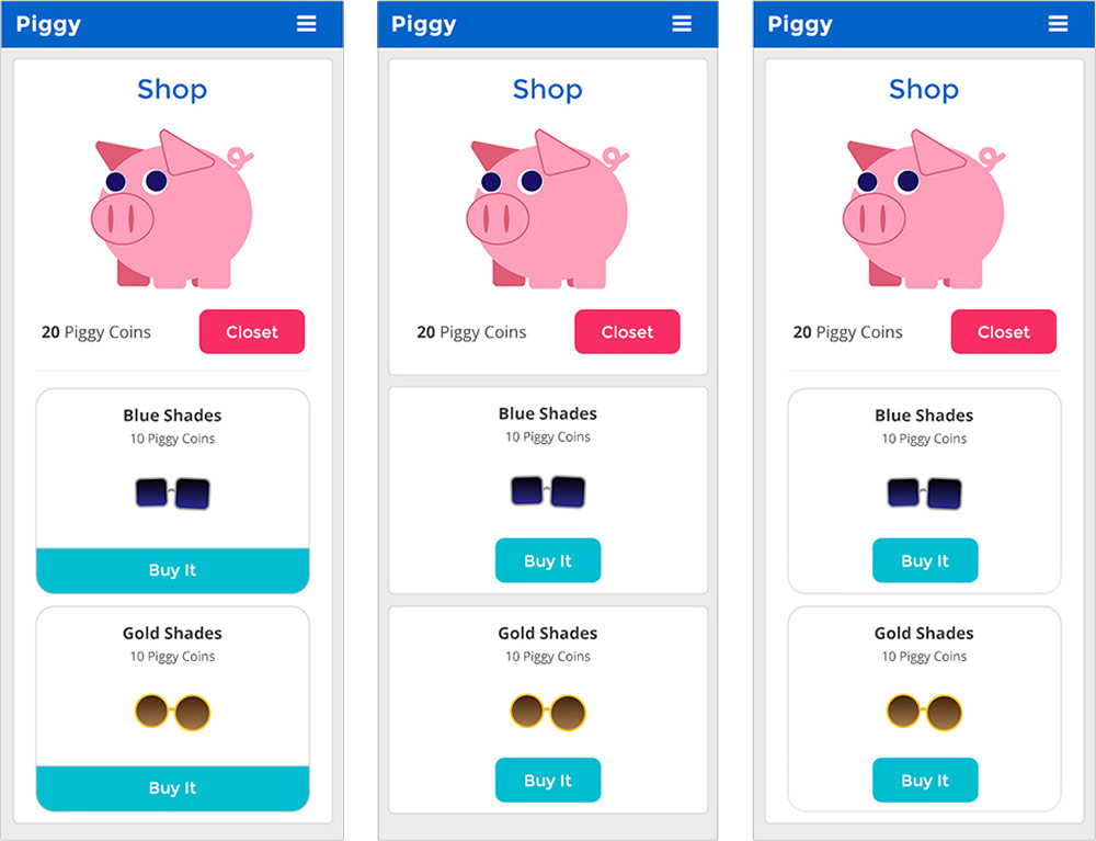
Different options considered for the shop and closet layout. We used the more unified layout on the right.
Ideally the app would have been structured for a weekly budget goal, but due to testing constraints, we had to use a daily system. Once our app was developed, we went through multiple rounds of user testing. Our main concerns were whether the setup guide was easy to comprehend, what should be highlighted on the user dashboard, and whether the logging tool for purchases and income was quick and intuitive. We also conducted A/B testing to determine how to arrange the home page in order to encourage new users to explore the app.
It’s easiest to keep of your spending when you have your budgeting tool at hand. With a mobile-first design, Piggy can be used anywhere, anytime. It keeps the site clean and simple.
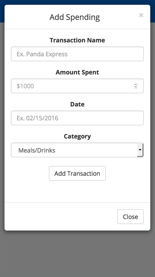
All text is designed to be clear and straightforward. We took special care in walking the user through the setup process by explaining each step and how their budget is calculated, so that users understand how they will reach their goal.
The pig avatar is the clearest element of user delight, but we also tried to incorporate other fun elements. One thing our testers really appreciated was the “Get Nakey” button in the Closet page.
COURSE: Interaction Design
PROJECT DURATION: 8 weeks
ROLE: UX/UI and Visual Designer, Front-end Developer
The team equally participated in the design and research phases, but I was personally responsible for the site’s visual design and most of the front-end development. For this project, I pushed myself to learn JavaScript so I could implement the shopping and dress-up actions.